Campus Bite
Campus Bite is and reducing friction in everyday dining decisions. everyday dining decisions.
Role
Role
Quick Access


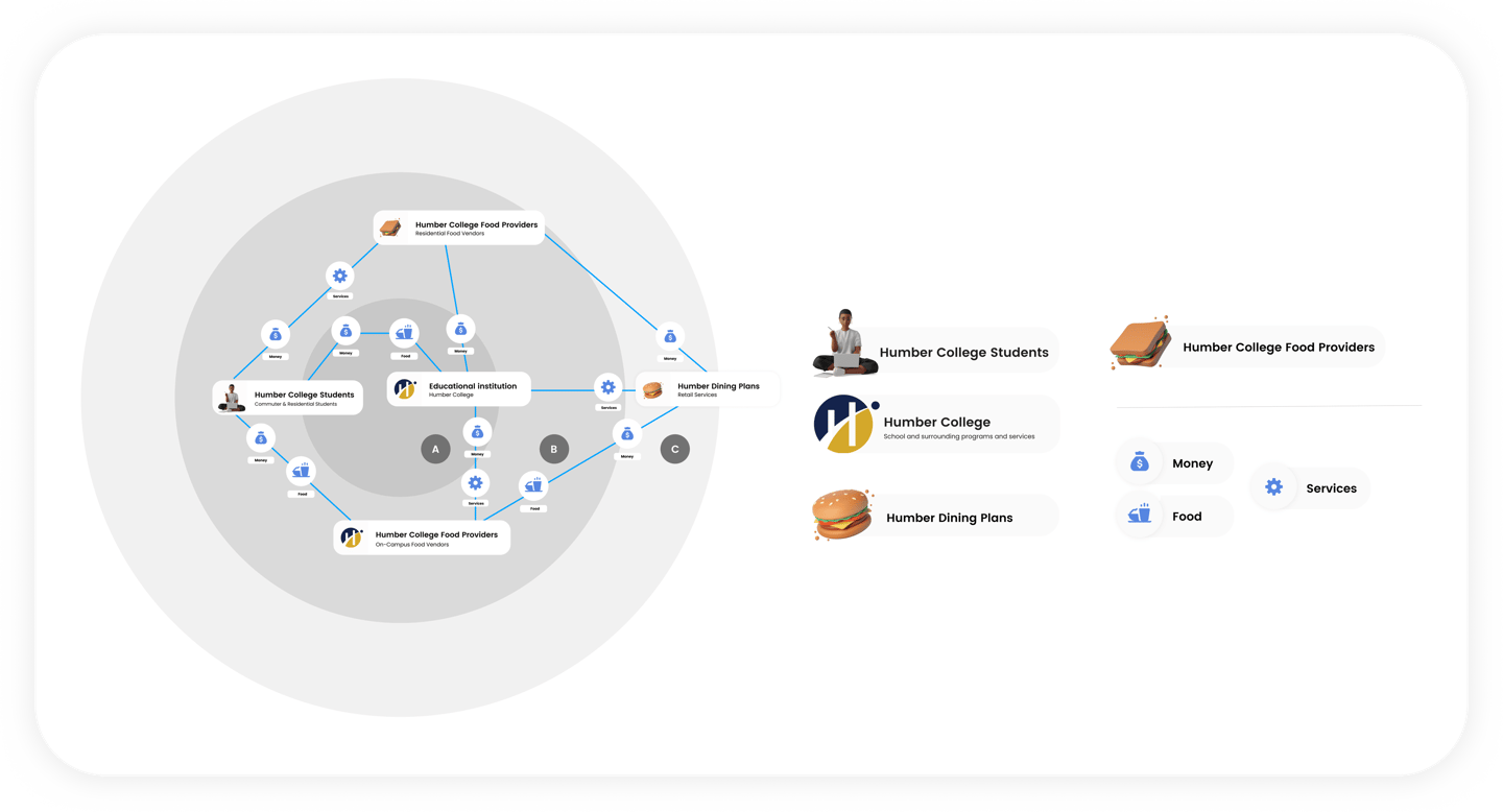
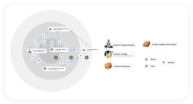
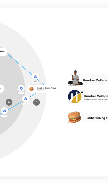
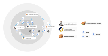
To understand how on-campus dining actually works, I mapped out the key stakeholders involved at Humber College’s North Campus. This helped clarify how decisions, constraints, service gaps across food providers, dining plans, and the institution directly impact students.
Brief
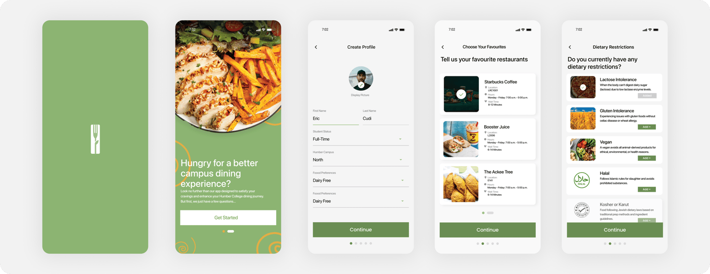
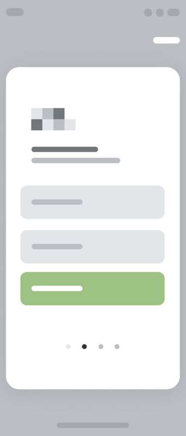
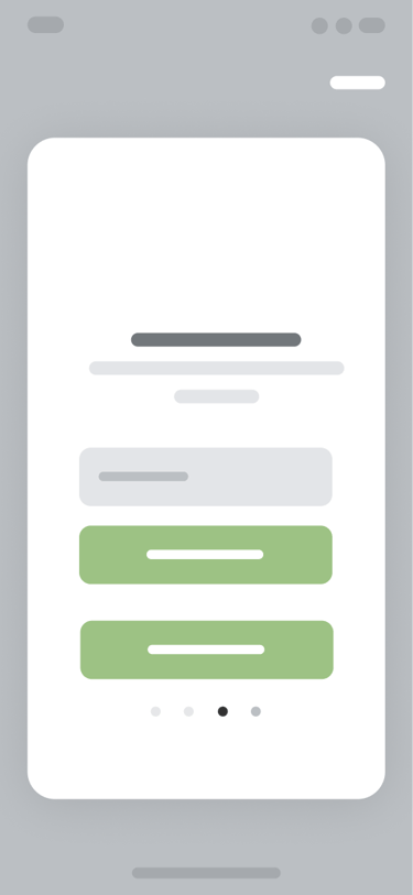
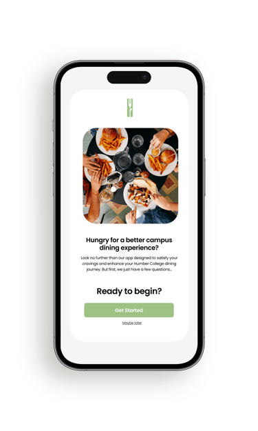
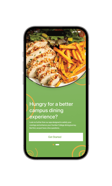
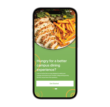
Campus Bite is a concept mobile app focused on improving the on-campus dining experience at Humber College’s North Campus.
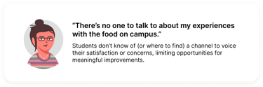
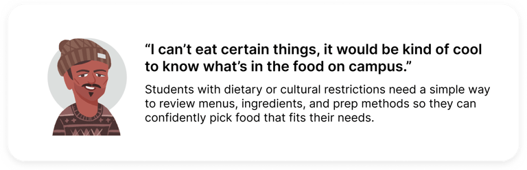
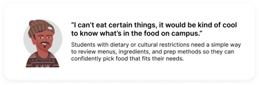
Students struggled to get food on campus due to long wait times, limited and hard-to-find options, and frequent closures at the time. Over time, this created a dining experience filled with friction and a lack of intuitiveness, where students interacted with campus food services out of necessity rather than genuine desire.
Problem
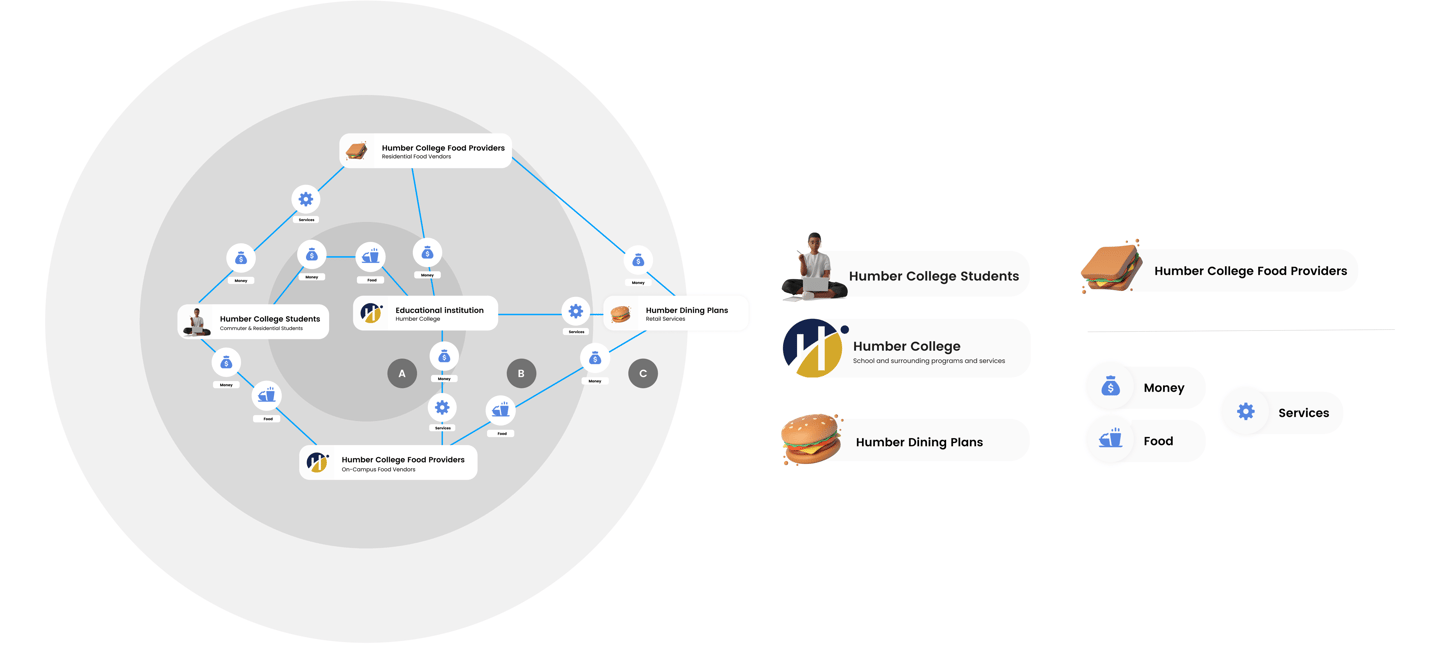
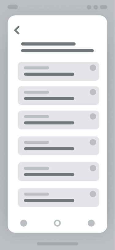
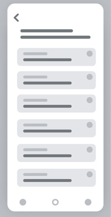
Behind the Dining: Stakeholder Map
Constraints
and Challenges
This project had a few real constraints that influenced the project's direction:
On-campus dining is managed by a single vendor (Chartwells), limiting flexibility around food options and operational changes
The scope was focused on digital solutions only, with no ability to address physical space or infrastructure. So no removing, relocating, or adding restaurants.
Food-related tools on campus saw such low adoption, indicating some sense of demoralization from students when it comes to solutions in this field.
The project's timeline allowed for a week and a half of research, making time optimization crucial when collecting information.
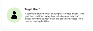
Target Users
Campus Bite looks at how a more intuitive and personalized digital experience could make navigating campus food options easier for students. The goal is to keep things clear, accessible, and engaging, so on-campus dining feels simpler and more student-centric.
Existing Solutions
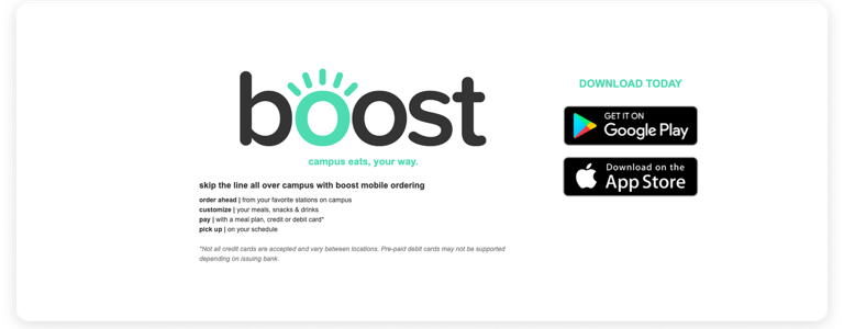
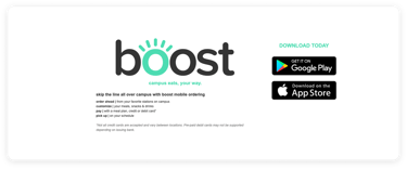
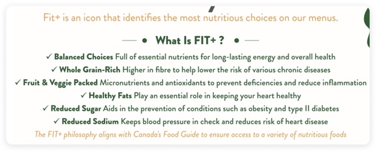
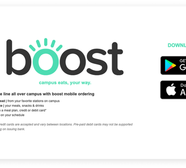
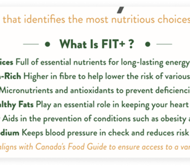
Humber College had a few food related tools in place, but they never really stuck. FIT+ helped flag healthier menu options, and Boost was meant to let students skip the line with mobile ordering, but from my experience, hardly anyone used it, and it didn't work as intended. Neither solution fully addressed wait times, limited options, or the overall frustration around getting food on campus.
User Research
1 - Diary Study
Students documented their daily dining choices over a two week period to capture real world behaviours and decision making. This helped reveal patterns around convenience, vendor familiarity, and how availability influenced food choices.
2 - User Interviews
Interviews explored the feelings and expectations behind students’ dining behaviours. These conversations helped me better understand individual experiences with on-campus dining, while speaking with a Chartwells operations manager gave me insight into operational constraints.
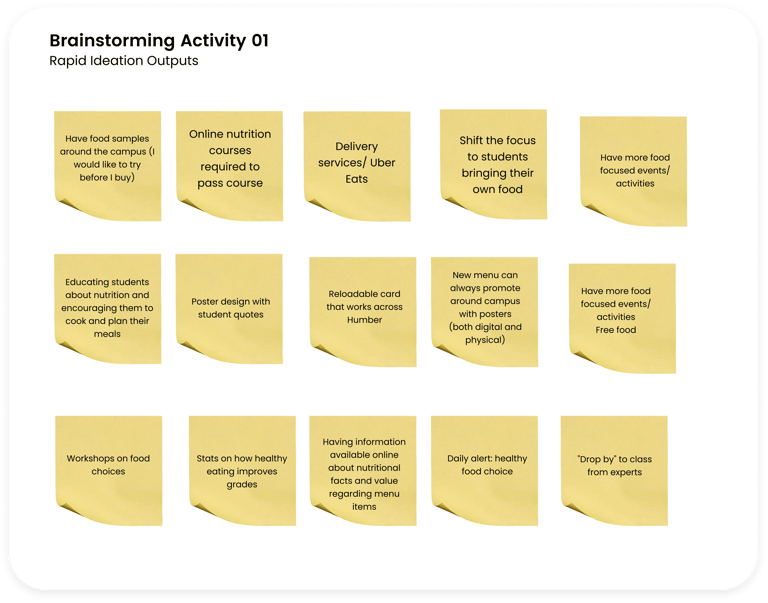
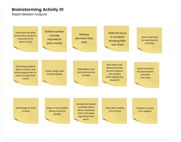
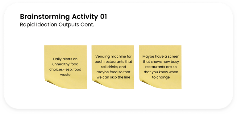
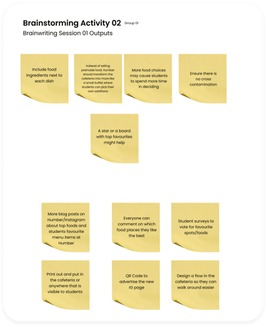
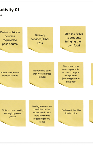
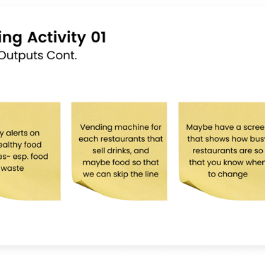
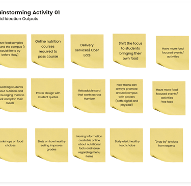
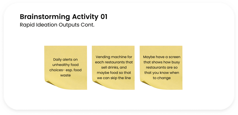
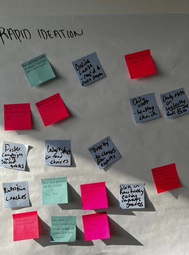
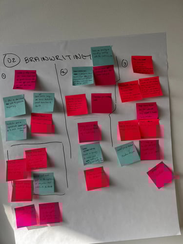
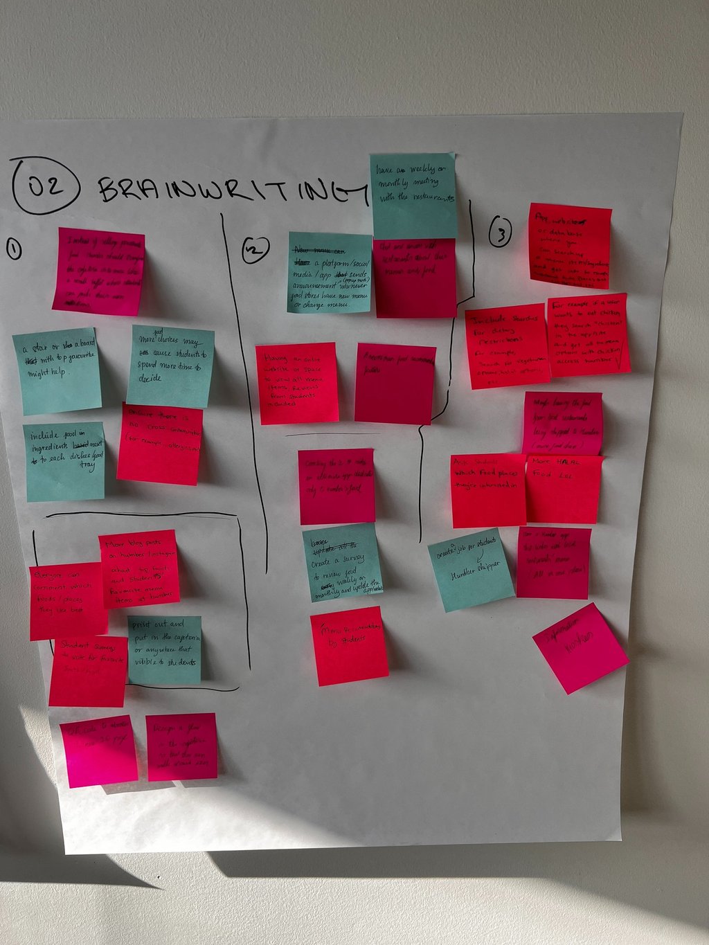
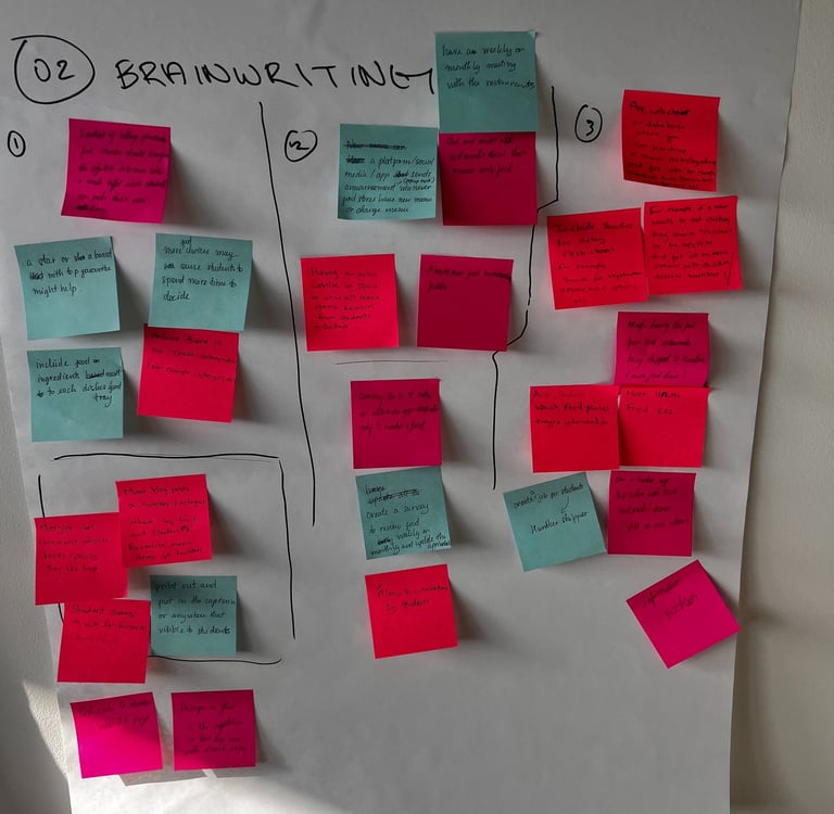
3 - Co-Creation Ideation Workshop
The co-creation workshop invited students to help brainstorm ways to improve the campus dining experience. We shared ideas based on our own experiences, which helped bring opportunities around personalization, clarity, and ease of use
to life.
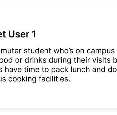
4 Commuter Students | 3 Residential Students | 1 Chartwells Employee
4 Commuter Students | 4 Residential Students
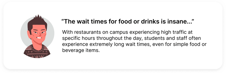
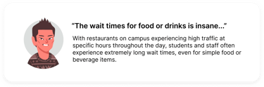
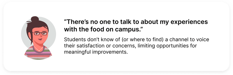
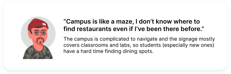
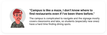
Research Findings

Research findings from the diary study, interviews, and workshop highlighted clear patterns in how students navigate on-campus dining. Check them out below:


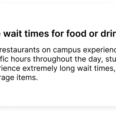
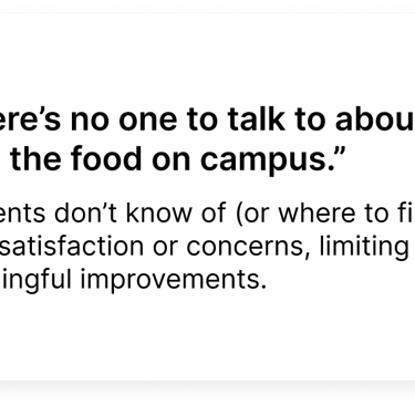
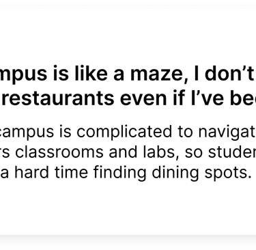
How Might We reduce friction in on campus dining by helping students see what is open, how long it will take, and whether options can meet their needs before committing?
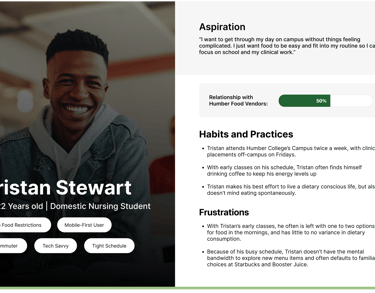
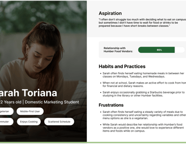
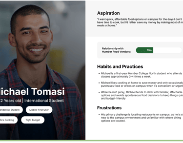
User Personas
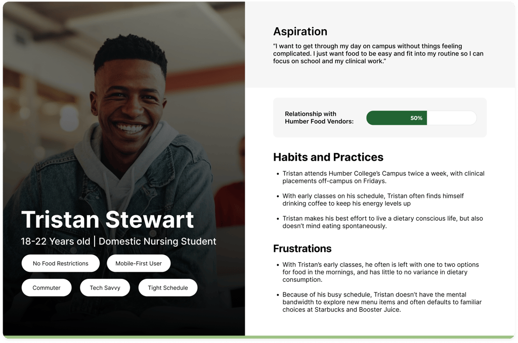
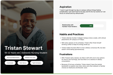
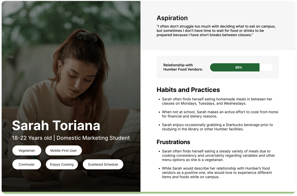
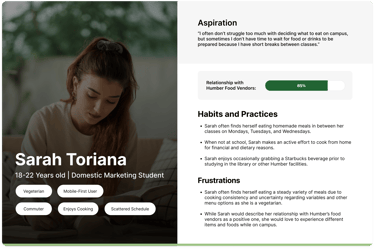
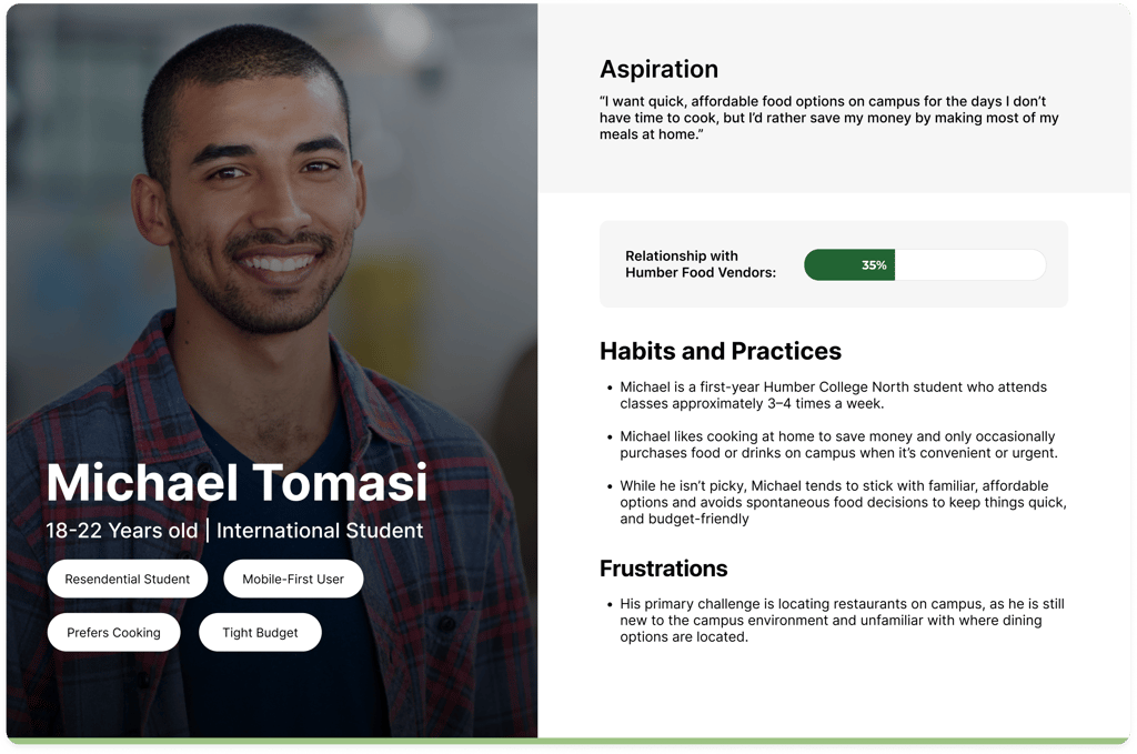
Based on insights from the diary study, interviews, and co-creation workshop, I developed user personas to represent common student behaviours and needs around on-campus dining. These personas helped ground design decisions in real time.
To understand how on-campus dining actually works, I mapped out the key stakeholders involved at Humber College’s North Campus. This helped clarify how decisions, constraints, service gaps across food providers, dining plans, and the institution directly impact students.
Brief
Campus Bite is a concept mobile app focused on improving the on-campus dining experience at Humber College’s North Campus.
Students struggled to get food on campus due to long wait times, limited and hard-to-find options, and frequent closures at the time. Over time, this created a dining experience filled with friction and a lack of intuitiveness, where students interacted with campus food services out of necessity rather than genuine desire.
Problem
Behind the Dining: Stakeholder Map
Constraints
and Challenges
This project had a few real constraints that influenced the project's direction:
On-campus dining is managed by a single vendor (Chartwells), limiting flexibility around food options and operational changes
The scope was focused on digital solutions only, with no ability to address physical space or infrastructure. So no removing, relocating, or adding restaurants.
Food-related tools on campus saw such low adoption, indicating some sense of demoralization from students when it comes to solutions in this field.
The project's timeline allowed for a week and a half of research, making time optimization crucial when collecting information.
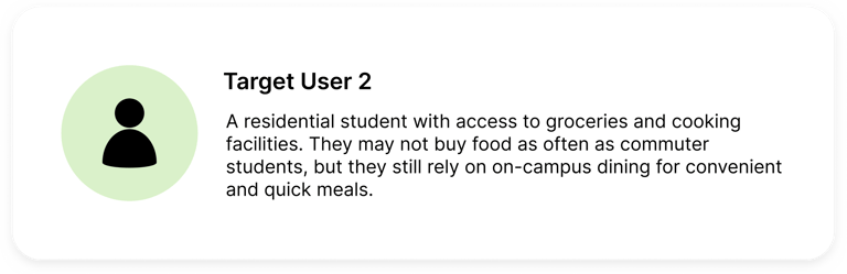
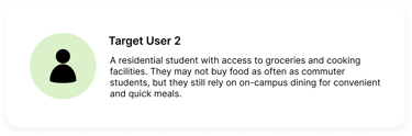
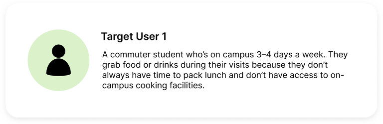
Target Users
Campus Bite looks at how a more intuitive and personalized digital experience could make navigating campus food options easier for students. The goal is to keep things clear, accessible, and engaging, so on-campus dining feels simpler and more student-centric.
Existing Solutions
Humber College had a few food related tools in place, but they never really stuck. FIT+ helped flag healthier menu options, and Boost was meant to let students skip the line with mobile ordering, but from my experience, hardly anyone used it, and it didn't work as intended. Neither solution fully addressed wait times, limited options, or the overall frustration around getting food on campus.
Campus Bite
Campus Bite is a dining application that focuses on simplifying food discovery and access, surfacing key menu and nutrition details, and reducing friction in everyday dining decisions.
Role
Role
Role
Quick Access
User Research
1 - Diary Study
Students documented their daily dining choices over a two week period to capture real world behaviours and decision making. This helped reveal patterns around convenience, vendor familiarity, and how availability influenced food choices.
2 - User Interviews
Interviews explored the feelings and expectations behind students’ dining behaviours. These conversations helped me better understand individual experiences with on-campus dining, while speaking with a Chartwells operations manager gave me insight into operational constraints.
3 - Co-Creation Ideation Workshop
The co-creation workshop invited students to help brainstorm ways to improve the campus dining experience. We shared ideas based on our own experiences, which helped bring opportunities around personalization, clarity, and ease of use to life.
4 Commuter Students | 3 Residential Students | 1 Chartwells Employee
4 Commuter Students | 4 Residential Students
Research Findings
Research findings from the diary study, interviews, and workshop highlighted clear patterns in how students navigate on-campus dining. Check them out below:
How Might We reduce friction in on campus dining by helping students see what is open, how long it will take, and whether options can meet their needs
before committing?
Research
User Interview
The diary study involved 8 participants documenting their daily food choices, habits, and experiences with on-campus vendors over a set two-week period.
Co-Creation Workshop
The diary study involved 8 participants documenting their daily food choices, habits, and experiences with on-campus vendors over a set period.
Research

User Personas
Based on insights from the diary study, interviews, and co-creation workshop, I developed user personas to represent common student behaviours and needs around on-campus dining. These personas helped ground design decisions in real time.
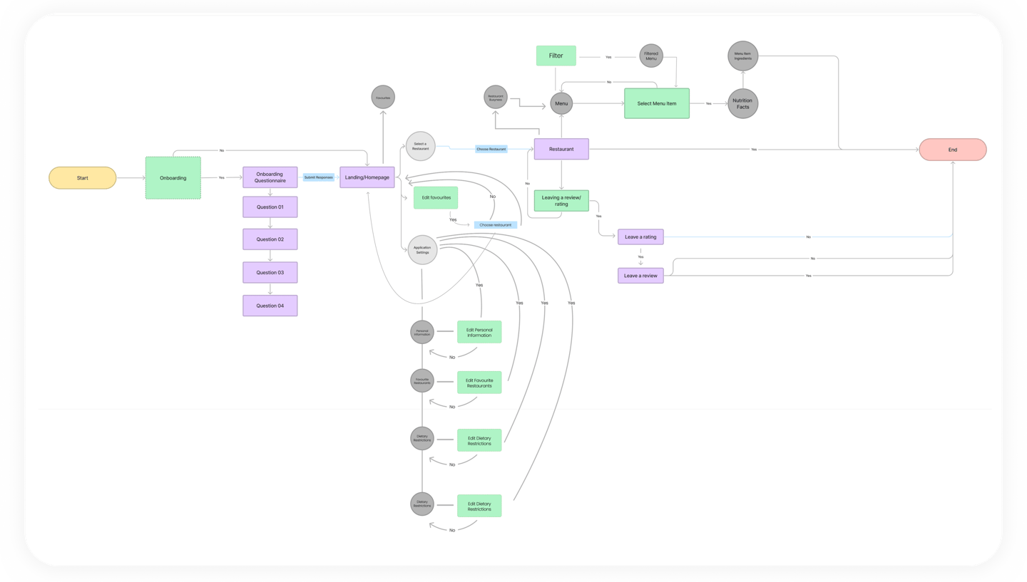
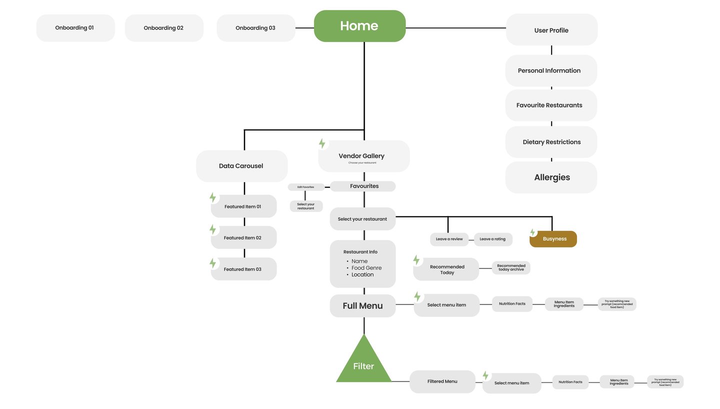
IA And
User Flow
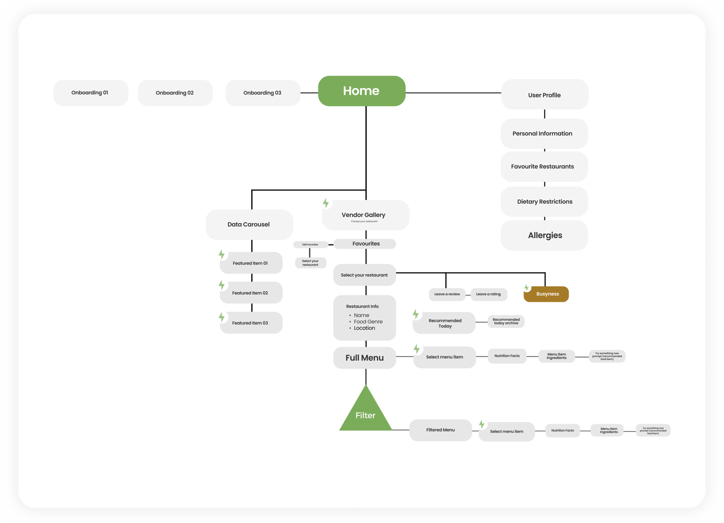
With an understanding of student behaviours, thoughts, and feelings about dining at humber, it was time to begin conceptualizing the framework of my proposed solution. In this, I was able to draft and create information architecture and a user flow to inform the preliminary stages of my design.

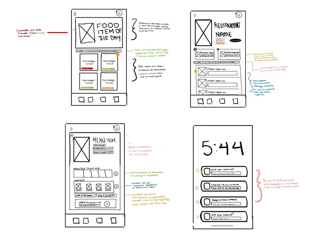
After defining the information architecture and user flow, I began sketching early concepts to explore layout ideas and feature placement. These sketches allowed me to quickly map out where key elements could live within the experience before moving into higher fidelity design.
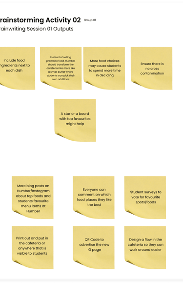
Ideation Post Brainstorm
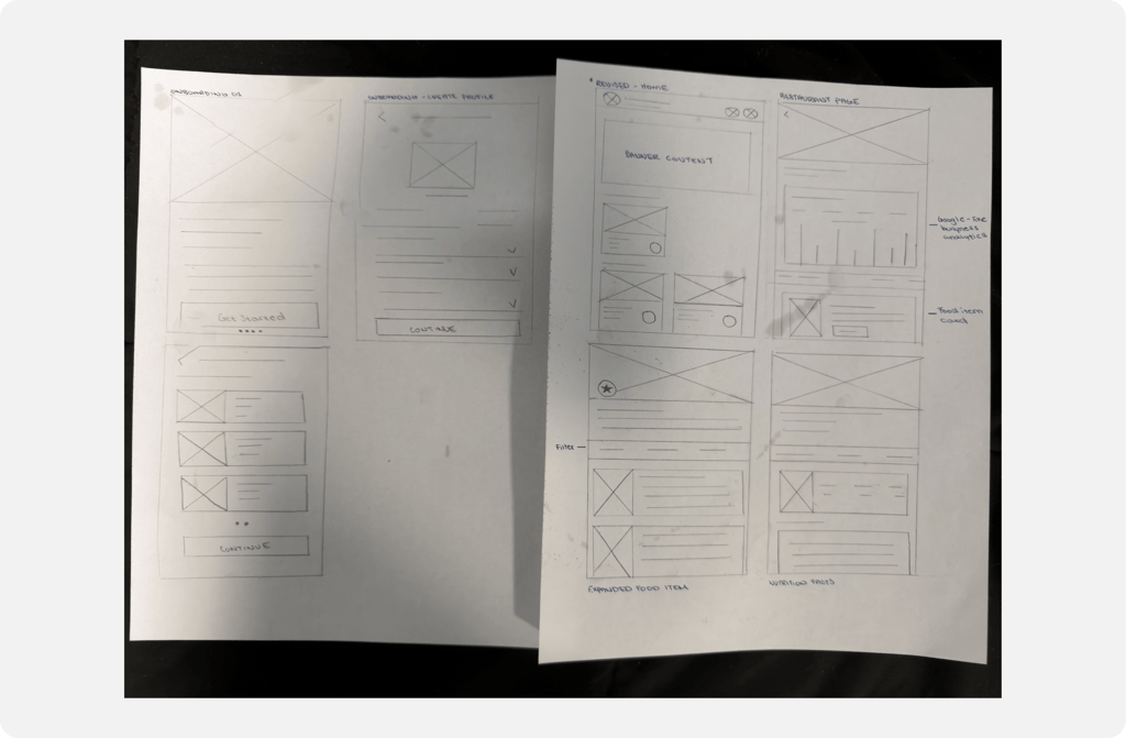
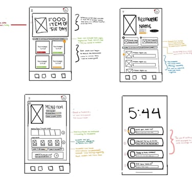
Wireframing The Solution
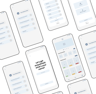
From there, I moved into wireframing to translate those early sketches into more structured layouts. Wireframes helped me define hierarchy, navigation, and interaction patterns, and also let me to test how users might move through the experience before adding in visual elements.
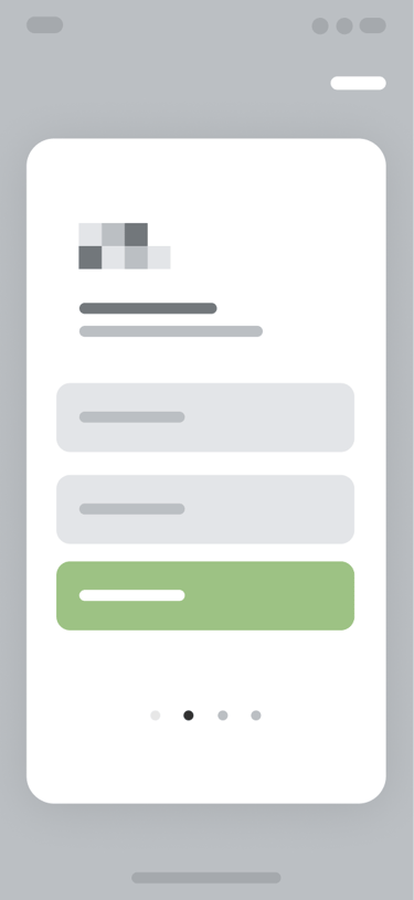
Design:
First Draft
From there, I started applying colour and branding, building on my original sketches. Feedback from fellow students helped highlight areas where the design wasn’t working visually or functionally, allowing me to make adjustments and improve the overall experience, which will be showcased in the next iteration.

Design:
Final Output
After applying this feedback, I was able to finalize the designs and create an experience that addressed the key frustrations shared by my peers. The final solution also better aligns with common patterns and best practices found in similar apps within this space.


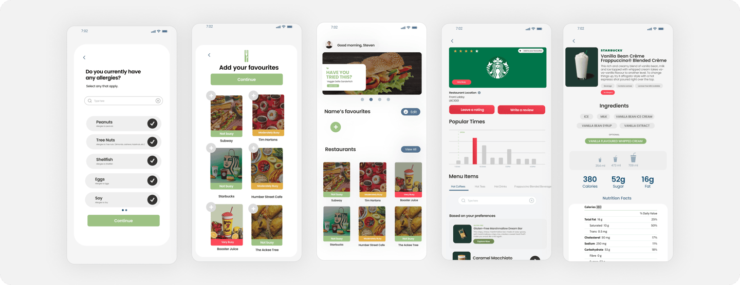
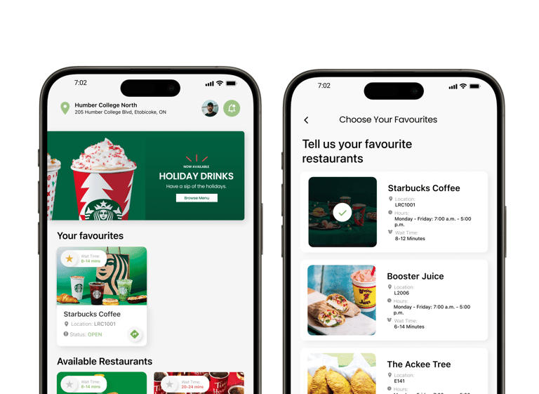
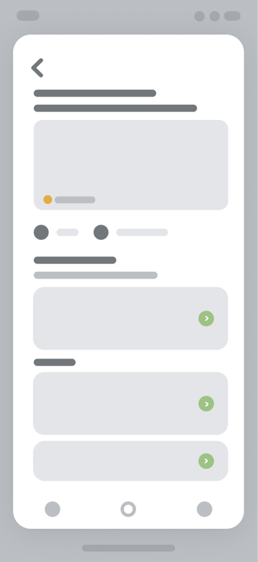
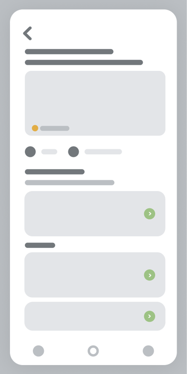
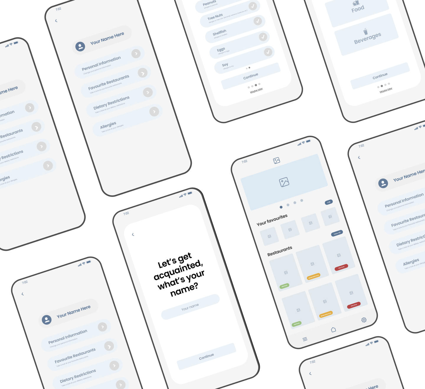
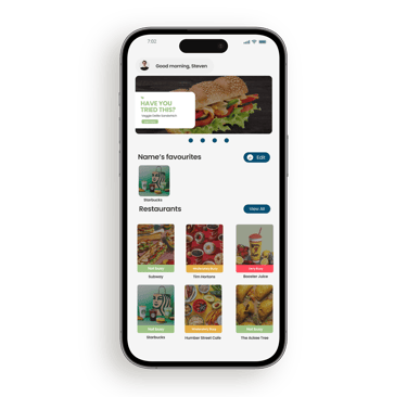
Information and Updates
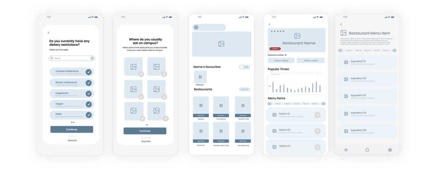
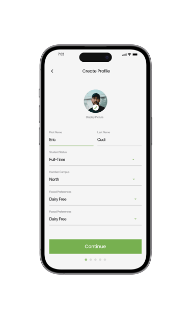
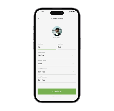
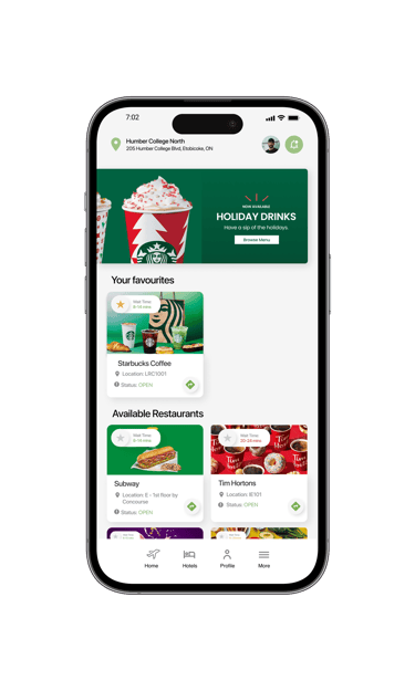
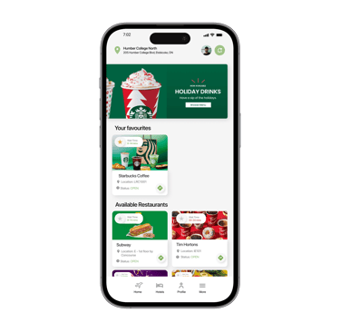
From the home screen, users can update their profile, adjust notifications, and see the latest campus dining updates in the top content banner.
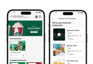
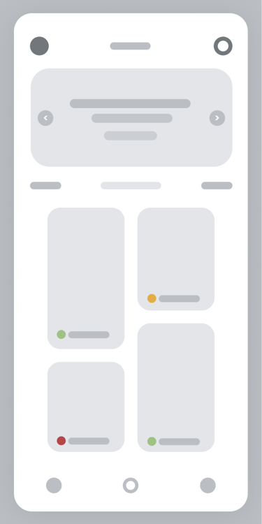
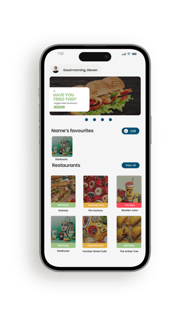
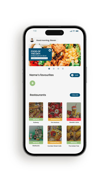
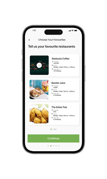
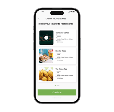
Favourite Restaurants
Users can save and remove favourite restaurants, making it easier to get back to the places they visit most.
Restaurants and Info
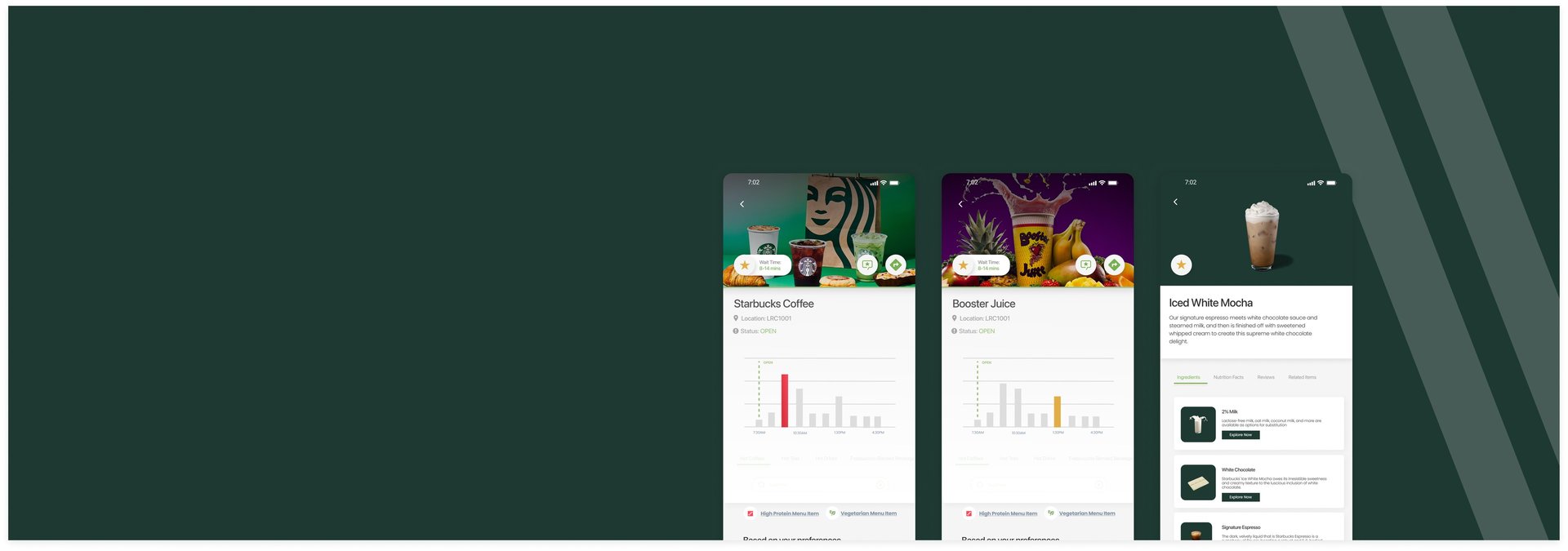
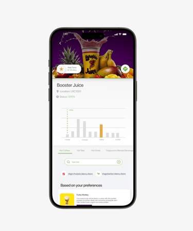
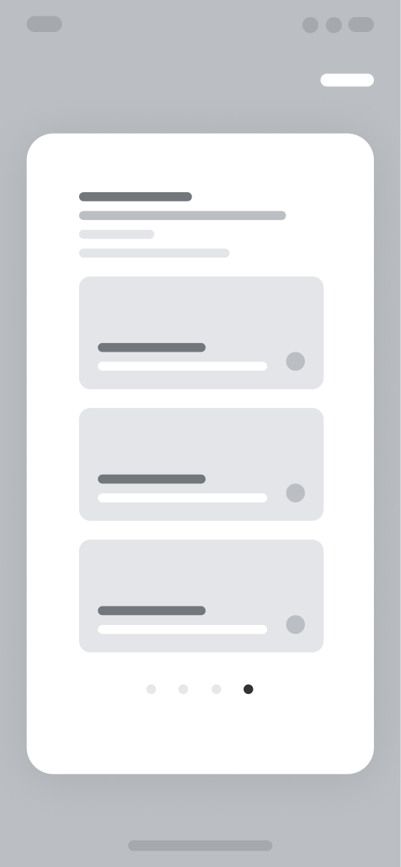
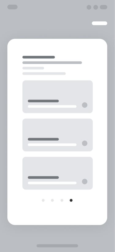
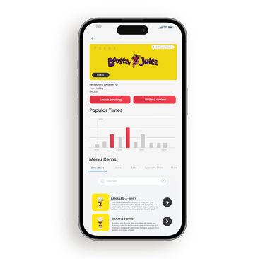
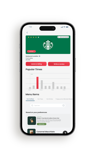
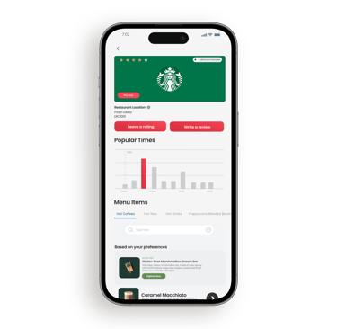
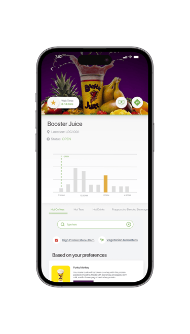
At a glance, users can see which restaurants are open, check wait times, save favourites, view locations, or get directions straight from the home screen

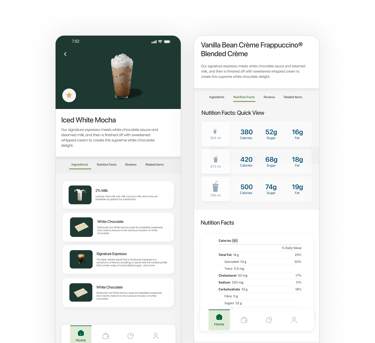
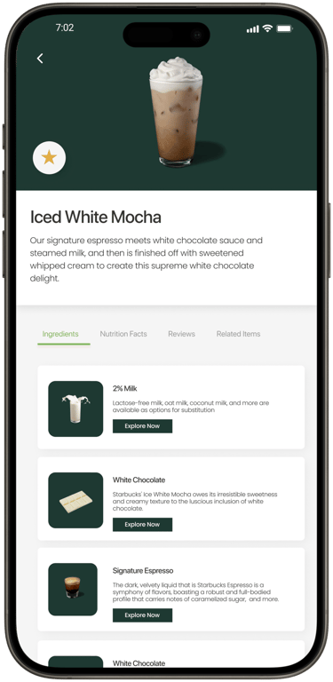
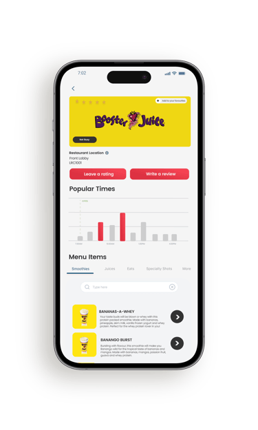
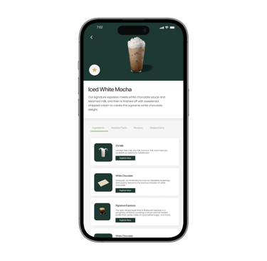
Restaurant Menu and Info
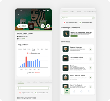
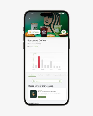
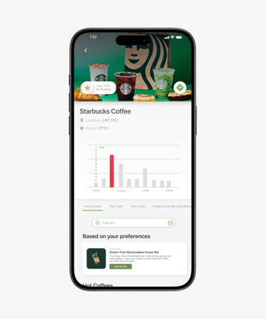
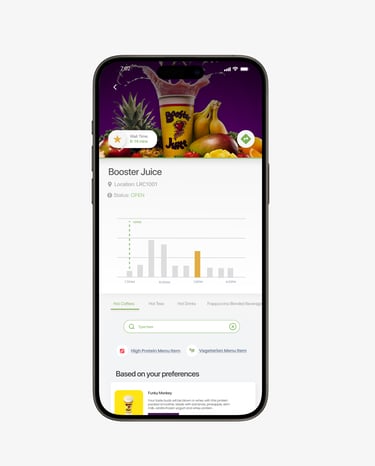
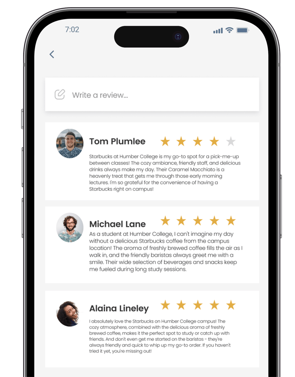
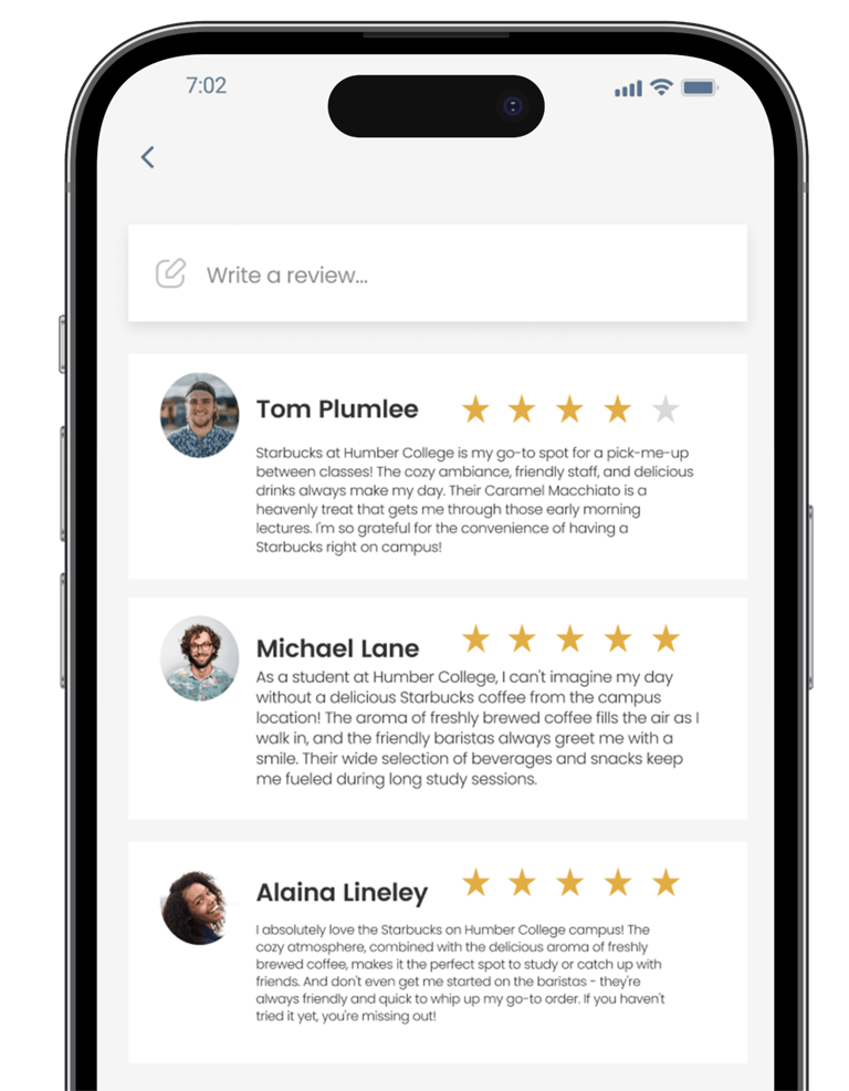
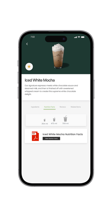
Selecting a restaurant gives users a deeper look at wait times, menu items, and reviews, with the option to leave feedback of their own via a review.
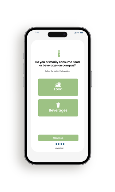
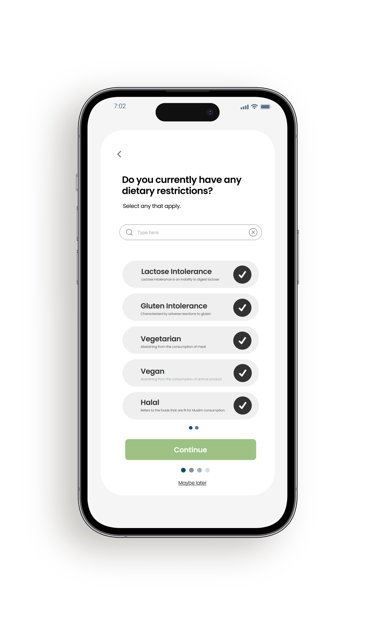
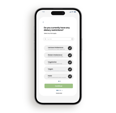
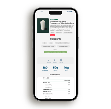
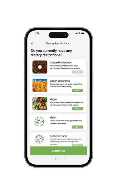
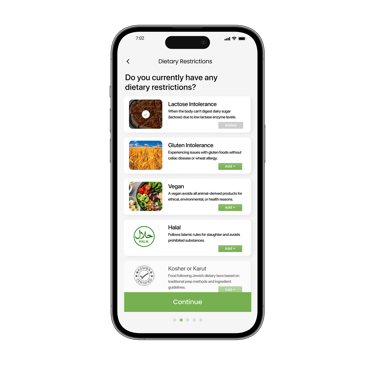
Dietary Information
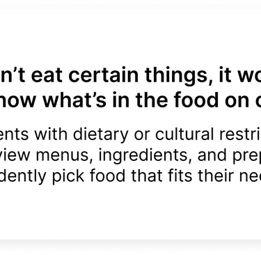
Menu items include detailed views and diet based badges that help users quickly identify options that fit their preferences.

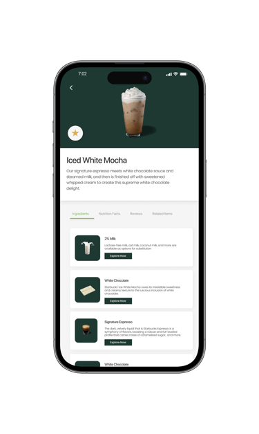
Menu Items Ingredients
The diary study involved 8 participants documenting their daily food choices, habits, and experiences with on-campus vendors over a set two-week period.
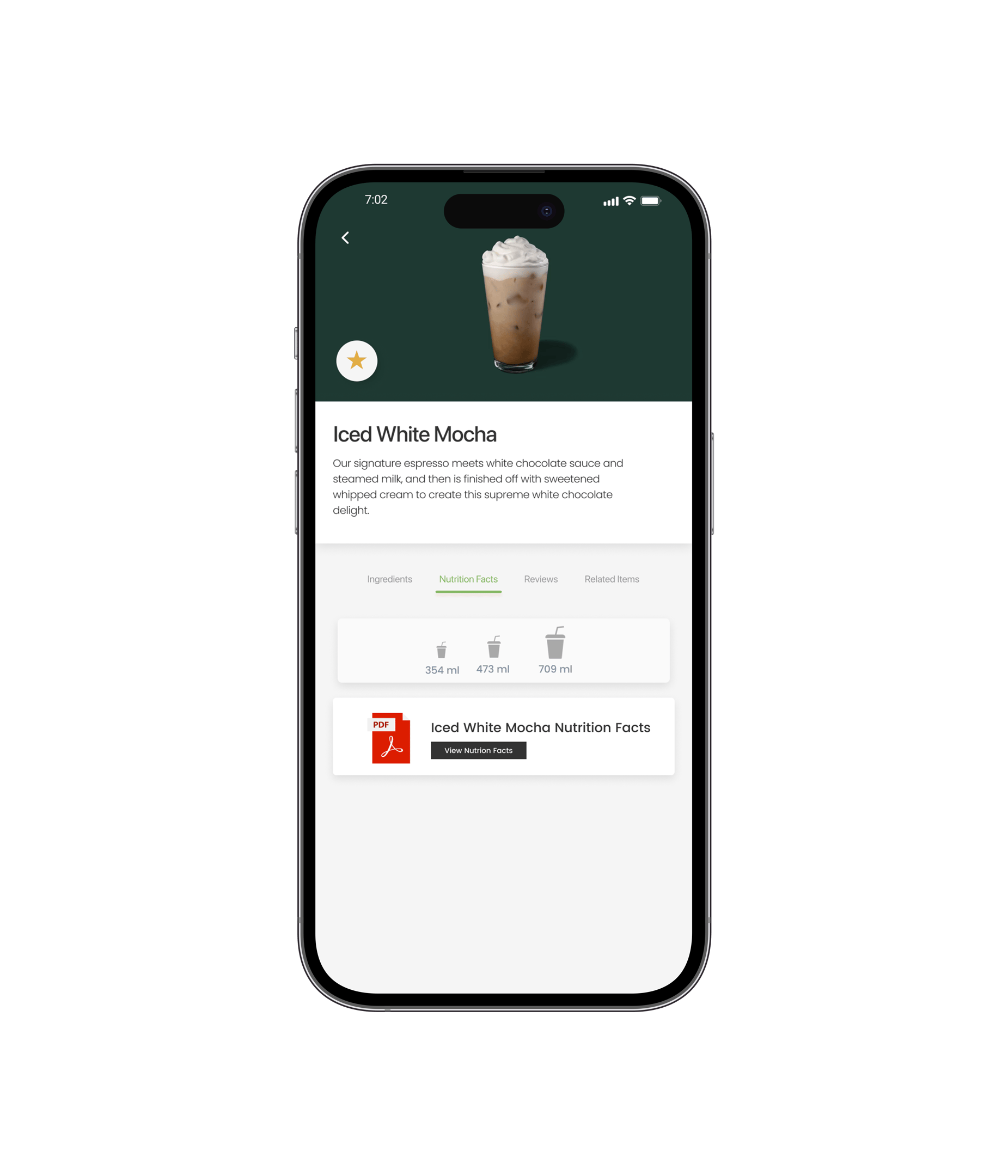
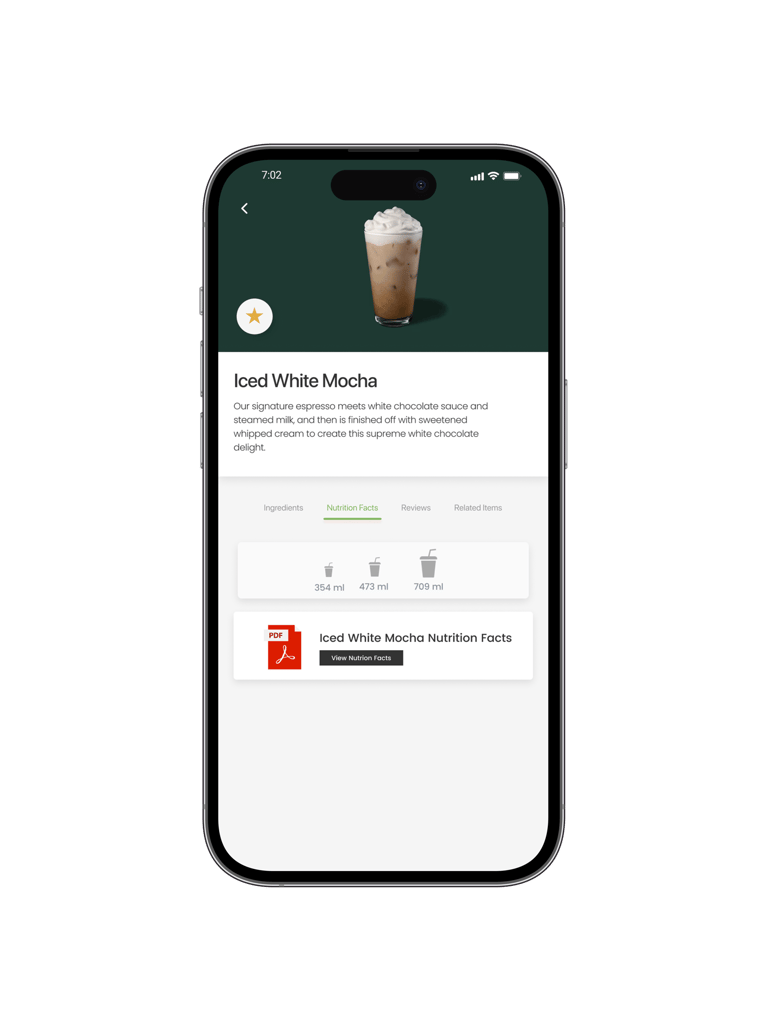
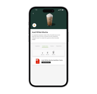
Nutrition Facts Quick and Detailed View
Nutrition information is presented in both quick glance and detailed views to support fast decisions and deeper exploration.
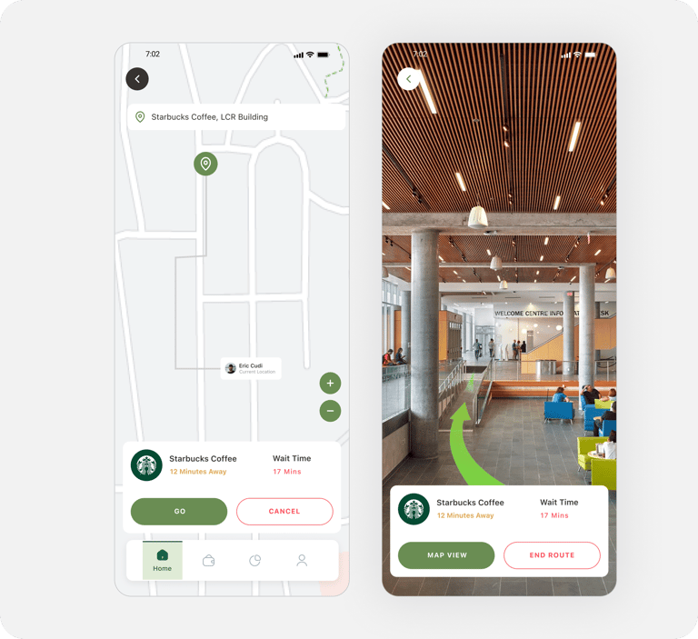

Restaurant Locations - Map View
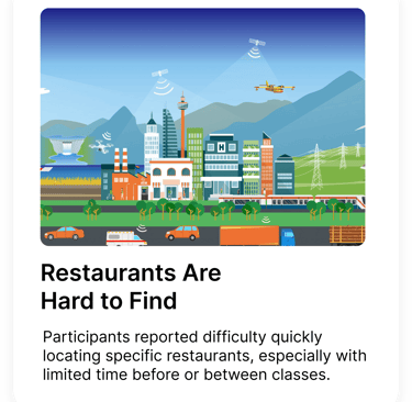
The map view gives students a classic navigation view of where each restaurant is located on campus. Users can also quickly see how far it is by foot, and how long the wait times are estimated to be.
Restaurant Locations - AR Navigation
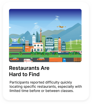
AR navigation helps students find restaurants more easily by guiding them through campus in real time. This feature is especially useful for students who are new to campus or short on time, reducing confusion and making it quicker to get from point A to point B.
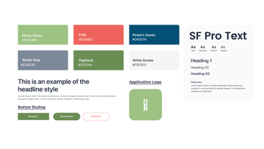
Identity and
Branding
Colour choices were informed by basic colour psychology and how people naturally associate certain colours with actions and emotions. Greens were used to signal “go,” confirmation, and food related actions, helping interactions feel safe and intuitive. Warmer accent colours were reserved for urgency or attention, while neutral tones helped balance the interface and keep the experience feeling calm and approachable.

Key Takeaways
Insights & Takeaways
This was my first large scale UX project where I had full ownership from research through design inception, it also ended up being the most comprehensive case study I have worked on. This meant that I was pushed to think through every step of the UX process while also learning how much infrastructure and corporate control can shape what problems are realistically solvable and for who. This also reinforced how important accessibility is when designing for real people (i'd like to keep this in mind more in future projects), and it taught me that understanding constraints early can help you frame the right problem for users without it feeling limiting or like a compromise.


Home Hub
The home hub is a centralized location where users can see on-campus food related promotions, their selected personal favourite restaurants, and restaurant wait times and statuses.
Users can also access their account information directly from the home hub to edit it should they need to.
The Solution
Wait Times
The Solution
Restaurant status, complete menus, and locations help students know if they're open, where they can find them, and what they can order.
Wait times help users know what to expect when seeking out a restaurant to dine at. These outputs are based on "busiest time" projections from campus vendor management.
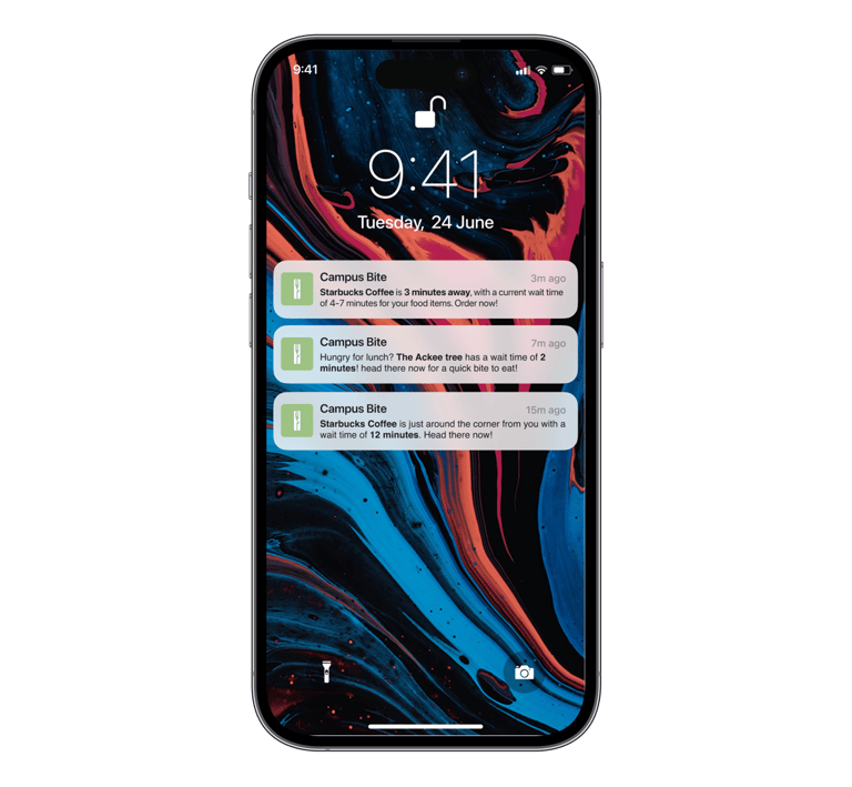
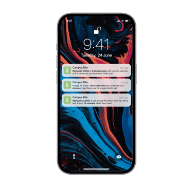
Notifications Keep Users In The Loop
Notifications let users know what restaurants are in proximity to them, and their estimated wait times so students know what to expect should they choose to indulge in their hunger or thirst on campus.
The Solution
Detailed Menus
Completed restaurant menus with nutrition facts, ingredients, and recommendations based on onboarding data shows users what they need.
To ensure each student's needs are tended to, I incorporated dietary filters on menus, offering high protein, gluten-free, lactose-free, and vegetarian selections.

The Solution
Reviews & Ratings
By talking to real students (and being one myself) I learned ratings and reviews could definitely help bring students together and foster community by letting them share their experiences to campus vendors and with other students.
The Solution
No project is free of limitations.
Dependence on Chartwell:
Humber’s food offerings are controlled by Chartwell, a major food vendor in North American retirement, and post-secondary communities. Changing the food selection was simply not an option.
No Physical Infrastructure Changes:
The project could not alter the physical layout of food locations or move vendors to different spots.
I could implement my own physical solutions or products onto campus.
Technological Feasibility:
Implementing machine learning-based solutions is not feasible given my real current capacity as a student.
Mining data for in-app solutions can be costly, time-consuming, or infeasible. I can only use my personal research findings to influence design decisions.
Impact: This constrains the sophistication of AI-driven, or physical tech-based features.
Cost and Feasibility of Advanced Features:
Integrating person-recognition technology for live line status tracking is expensive and likely unfeasible.
Impact: Alternative methods must be explored for queue monitoring.
The main purpose of this capstone thesis project was to solve my identified problem while operating within the confines of my real environment and my (often limited) capability as a design student.
Constraints
I wanted to better understand the challenges students and staff faced with on-campus dining at Humber College’s North Campus, like how convenience, variety, and accessibility shaped their choices. I looked at how they used the current services, what frustrated them, and how their experience could be improved. By combining qualitative and quantitative research methods, my goal was to gather insights to create a user-friendly, personalized dining solution that better fit the needs of the Humber North community.
Research Goals
Research Methods
Diary Study
The diary study involved 8 participants documenting their daily food choices, habits, and experiences with on-campus vendors over a set period.
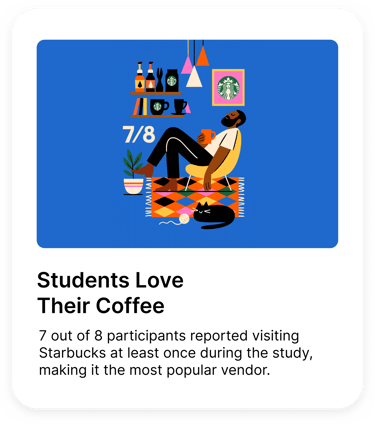
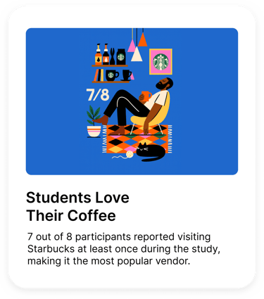
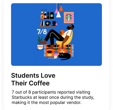
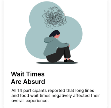
Starbucks Visits: 7 out of 8 participants reported visiting Starbucks at least once during the study, making it the most popular vendor.
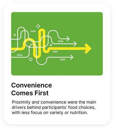
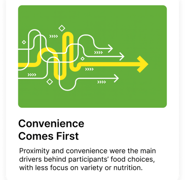
Decision Factors: Proximity and convenience were the main drivers behind participants’ food choices, with less focus on variety or nutrition.
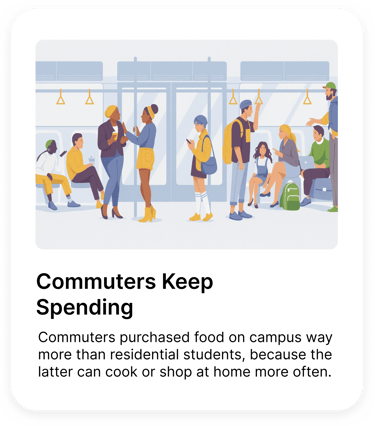
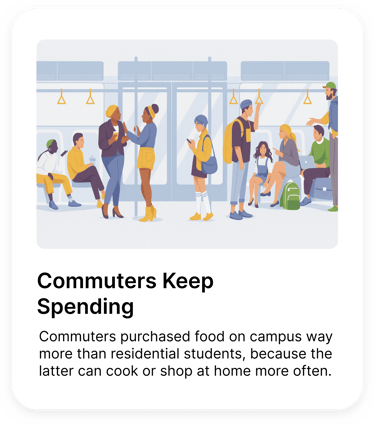
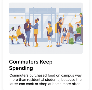
Purchasing Trends: Commuter students made more on-campus food purchases compared to residential students, indicating a potential disconnect with residential needs. This could also potentially indicate a lack in desire from residential students to purchase on-campus food as often due to having cooking, and grocer resources at their disposal.
Satisfaction Variation: Participants were generally happy with the drink options but expressed dissatisfaction with the food offerings on campus.

Research Methods
User Interview
The user interviews involved 4 participants and focused on gathering qualitative insights about their experiences, thoughts, and feelings regarding Humber College’s food offerings through discussion.
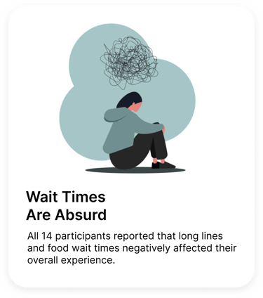
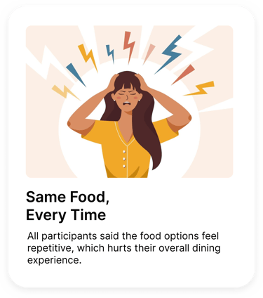
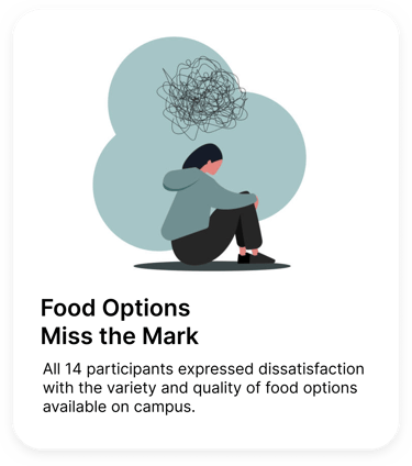
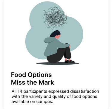
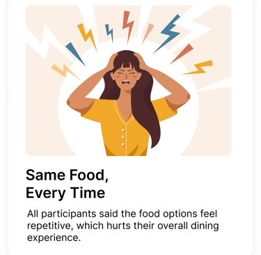
Overall Dissatisfaction: All 4 participants expressed dissatisfaction with the variety and quality of food options available on campus.
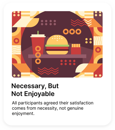
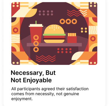
Necessity Over Enjoyment: 4/4 participants said their satisfaction with on-campus food comes from necessity rather than genuinely enjoying the offerings.
Limited Variety: Every participant agreed the current food options lack variety, which negatively impacts their dining experience.
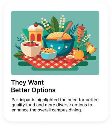
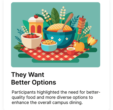
Suggestions for Improvement: Participants highlighted the need for better-quality food and more diverse options to enhance the overall campus dining experience.


Research Methods
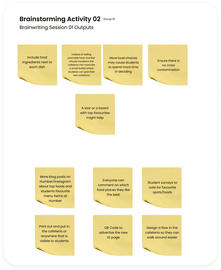
Co-Creation Workshop
The co-creation workshop brought 7-9 participants together to collaboratively brainstorm and ideate potential improvements to on-campus dining experiences.
Top Priorities: Participants emphasized the importance of introducing healthier food options and greater variety to better meet diverse dietary preferences.
Vendor Feedback: Many felt that existing vendors lacked cultural diversity in their offerings, leading to limited appeal for a broader student demographic.
Environmental Considerations: Sustainability emerged as a key concern, with participants suggesting eco-friendly packaging and waste reduction initiatives.
Design Process
I developed a service blueprint to map the interactions between Humber College students, food providers, and the dining services, highlighting the relationships, processes, and exchanges that occur within this system.
Design Process
I then developed information architecture by analyzing user research findings like diary study data, interview insights, and workshop outputs, to understand users' needs, behaviours, and priorities.
Design Process
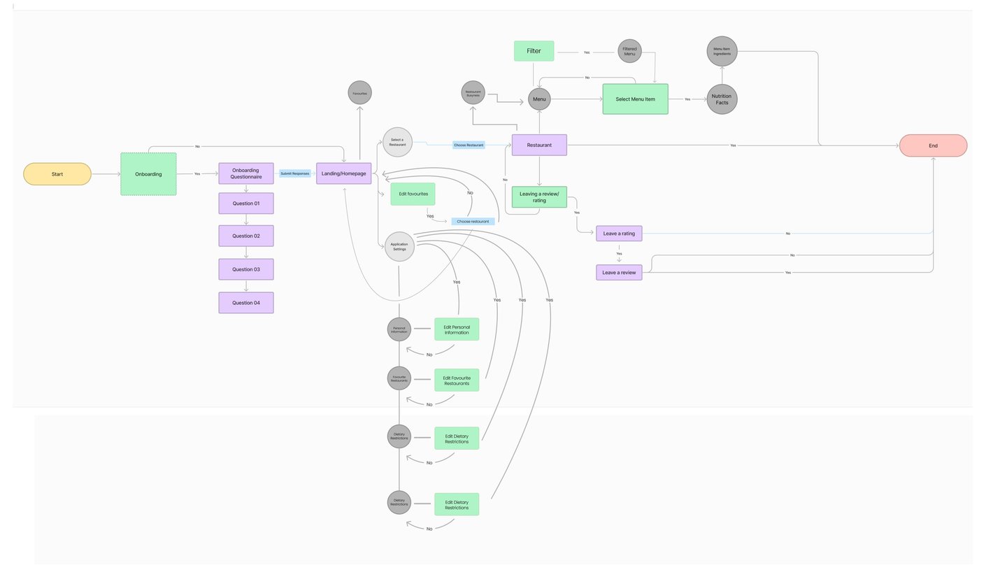
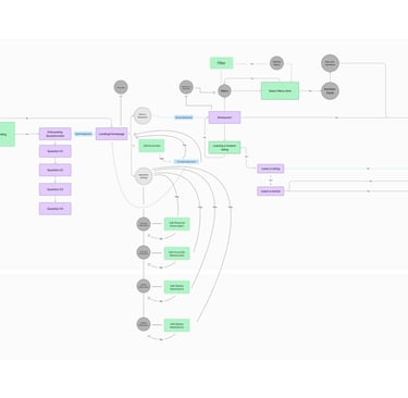
After establishing the information architecture, I developed a user flow to visualize the steps students take to interact with on-campus services related to dining.
Full-Scale View
For a full-scale view of the user flow, please click the link below.
Design Process
I then started drafting sketches to conceptualize my solution to the identified problem.
Design Process
After sketching out some of my concepts, I decided to start mapping out their functional locations through wireframing.


Design Process
I further refined these wireframes. Establishing component and media placement across different screens and scenarios.
Design Process
Once I figured out the framework for the original design, I began to flesh it out with visual elements like colour, iconography, photos and branding.

Design Process

Taking a closer look after the project closed, I wanted to add more contemporary and familiar design components to improve the overall look of the digital output, without sacrificing its original scaffolding.
What did I learn? Let's talk about
key takeaways
Try to know your constraints before you begin
This being my first, full scale UX project presented a few unexpected obstacles, the severity of the contextual constraints being one of them. If I was more aware of said constraints beforehand, this would have drastically redirected the focus of the original project. I used this lesson to guide my process work in future projects.
Accessibility is crucial
Accessibility (most notably colour contrast) is a very important way to to ensure your digital products can be used by everyone. With my current knowledge of accessibility practices and compliance requirements, I would have used these to create a more accessible application.
Sometimes, real change starts from above.
With so many companies having dominion over how food (and their services) are brought to students, it is evident that many of them have influence over the quality and accessibility of meals offered. This power allows them to shape eating habits, nutrition standards, and even the sustainability of food sourcing. By taking responsibility for these impacts, companies can lead real change, advocating for healthier, more sustainable options, and improved experiences that not only benefit students but also contribute positively to the broader environment.