MHS Storefront
A redesign of MHS’ digital storefront focused on improving product discoverability, clarity, and the overall purchasing experience.

Quick Access

The goal of this project was to improve the overall storefront experience by making products easier to browse, understand, and compare. To do this, we focused on:
Improving how product information is organized so key details are easier to find
Improve navigation to help users move through the storefront more quickly
Introducing new sections that surface important information without overwhelming users
Supporting cross-selling by helping users discover related products
Brief
MHS makes psychological assessments, training tools, and resources for professionals in mental health, education, public safety, and corporate fields. `
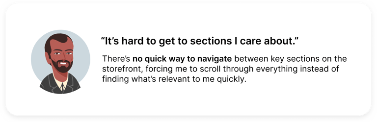
Users had a hard time navigating the site due to unclear product organization, poorly structured layouts, and accessibility issues, leading to confusion and
reduced confidence.
Problem
Project Goals
Timeline and Stakeholders
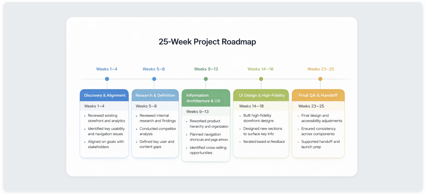
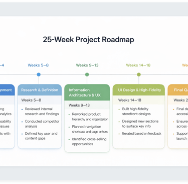
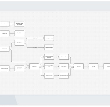
This project was delivered over a 25-week timeline and involved a lot of work with cross-functional stakeholders across design, development, marketing, and revenue departments. The roadmap below outlines each project phase, from early discovery and research to high-fidelity design, highlighting how decisions and priorities evolved over time.
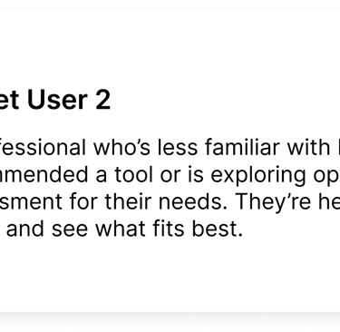
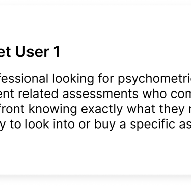
Target Users
With a wide variety of products offered for a number of different verticals, MHS is an industry leader that uses contemporary research, science, and technology to deliver tools that help us better understand, develop, and support people and organizations. As Product Owner, I worked with marketing, UX, development, and research teams to address challenges, leading a redesign that streamlined navigation, improved accessibility, and created a more intuitive shopping experience.


Old Design
Product Discovery
MHS sells psychological assessments, training tools, and resources for professionals in mental health,
Product Discovery (Cont.)
MHS sells psychological assessments, training tools, and resources for professionals in mental health,
Product Browsing and Purchasing
MHS sells psychological assessments, training tools, and resources for professionals in mental health,
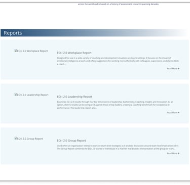
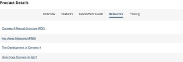
Product Resources
MHS sells psychological assessments, training tools, and resources for professionals in mental health,
Research
Competitive Analysis
Adobe: Adobe was an easy choice as a reference because of how clearly its products are organized, paired with a clean interface and strong visual hierarchy that makes browsing feel simple and intuitive.
Pearson: Pearson was a key reference for how they organize large sets of educational content and tools into clear, intuitive collections, making it easier for users to discover what they need.
Microsoft: I referenced their clear navigation, and consistent design system to guide improvements in usability and inclusivity

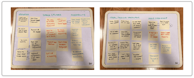
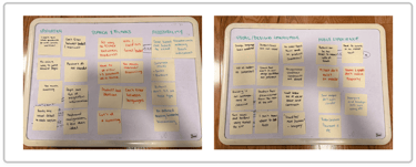
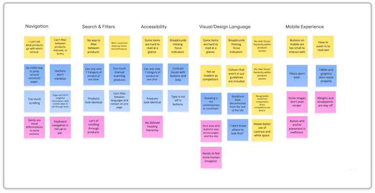
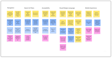
Affinity Diagram/Mapping
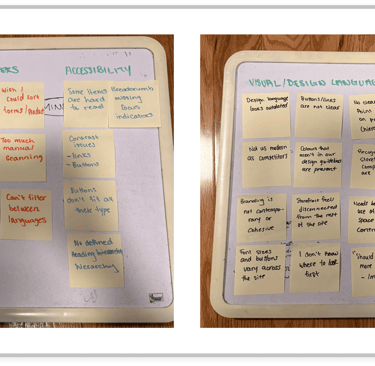
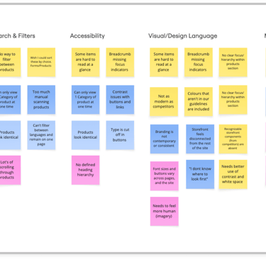
Using affinity mapping, we grouped interview insights into themes that highlighted specific pain points. These ended up focusing on navigation, search and filtering, accessibility, visual hierarchy, and mobile usability, helping us quickly see where users struggled most when browsing, comparing, and finding products.
Ideation Post Brainstorm
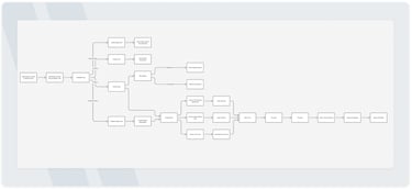
To explore potential solutions early on, we mapped out user flows and created preliminary sketches to test structure, navigation, and key interactions.
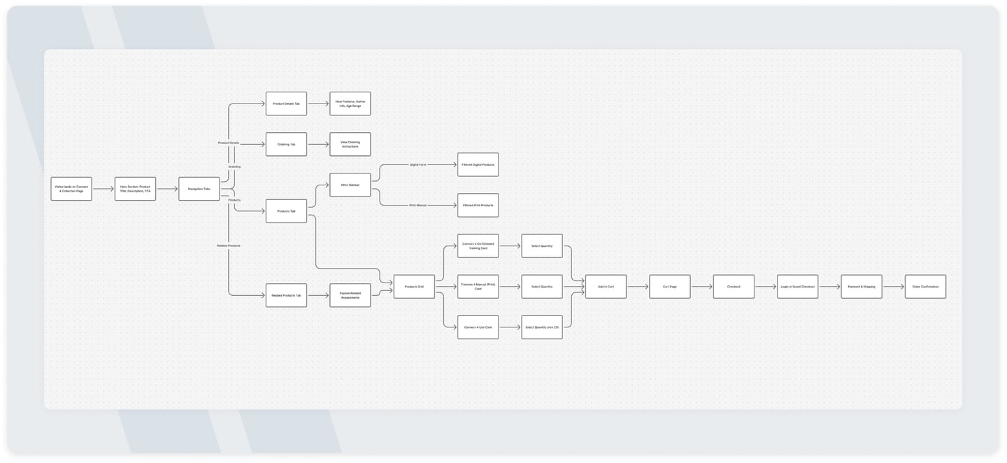
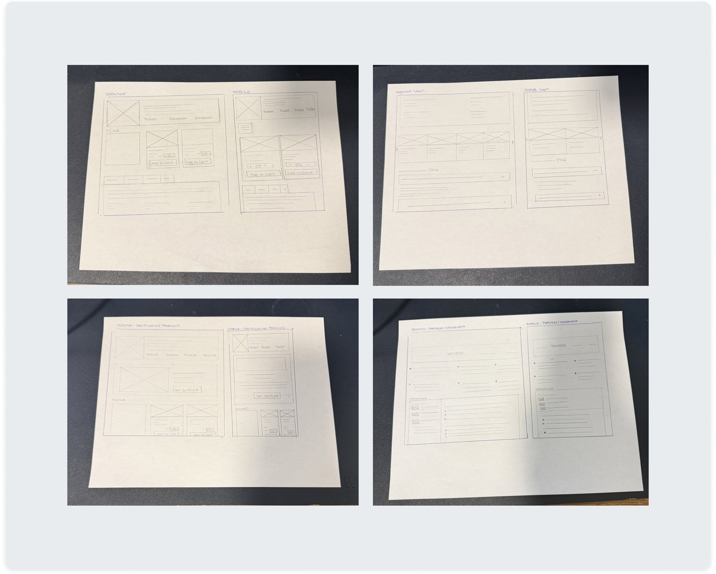
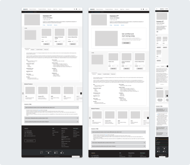
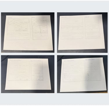
Product Framework
Building on the validated user flows and early sketches, we created wireframes to define layout, content hierarchy, and core interactions. This stage was somewhat of a "dynamic workshop" on clarity and usability, allowing us to refine structure, ordering and navigation before moving into higher fidelity designs.
Final
Outputs
The final designs bring together research insights, validated flows, and refined layouts into a cohesive storefront experience. These outputs focus on improving discoverability, clarity, and usability while aligning with MHS’s brand, accessibility standards, and business goals.
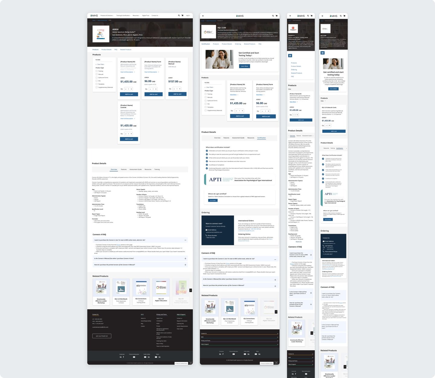
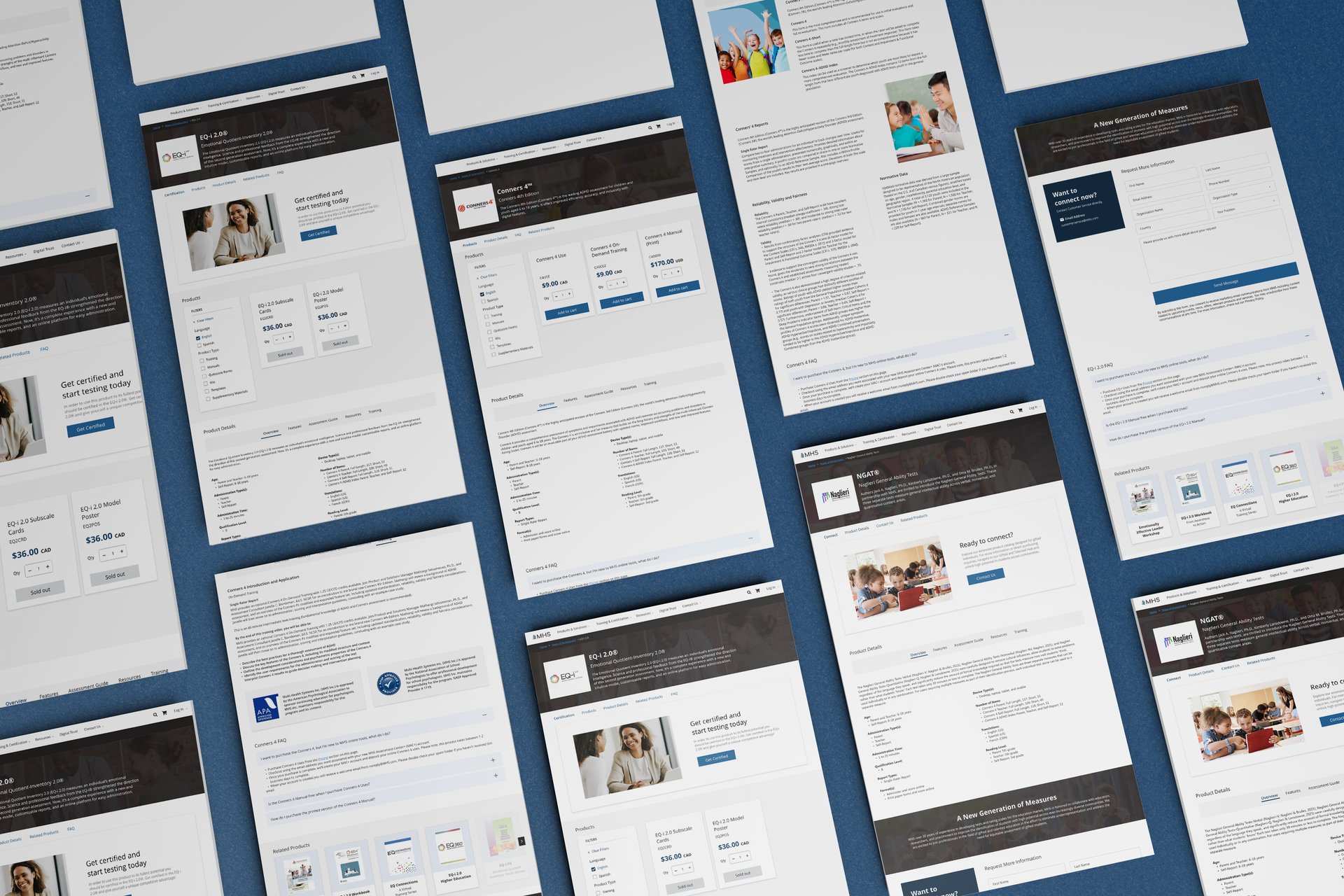
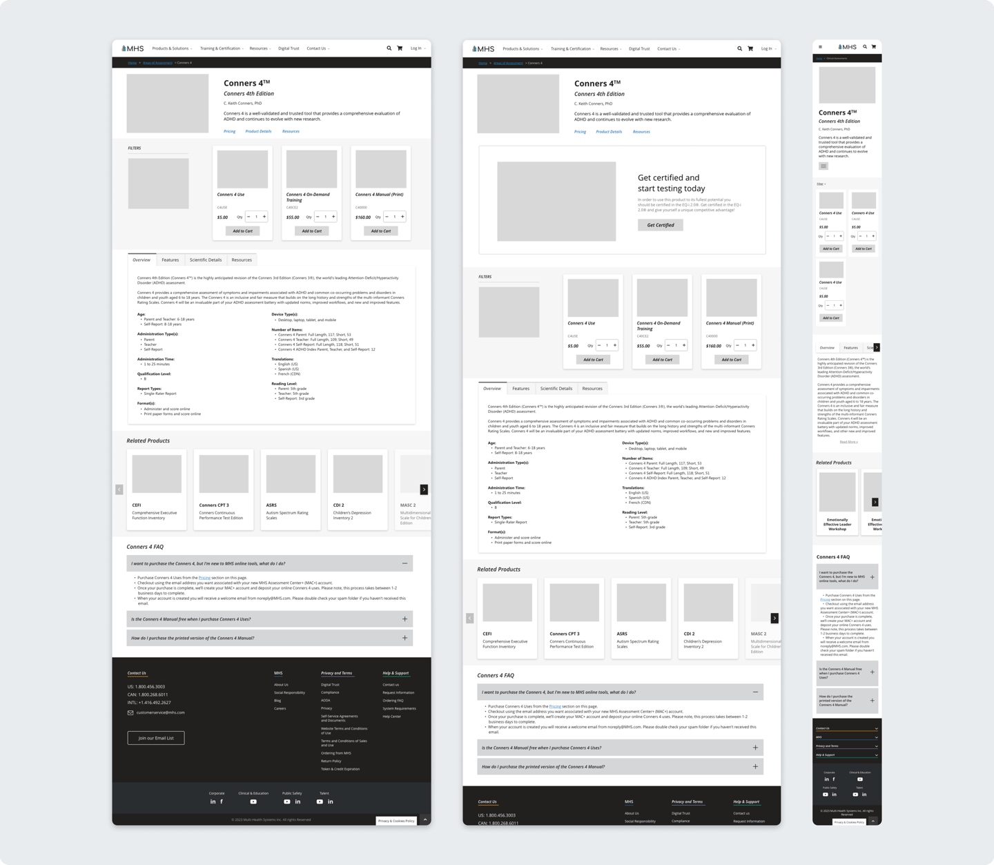
Designing the Product
FIRST ITERATION
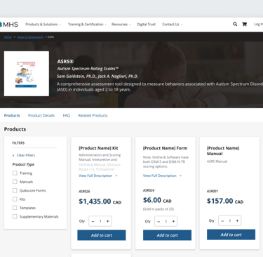
Product Browsing and Purchasing
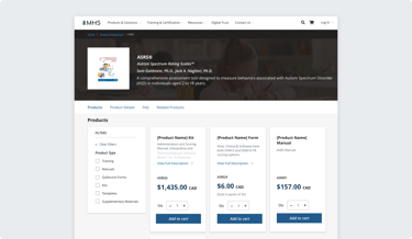
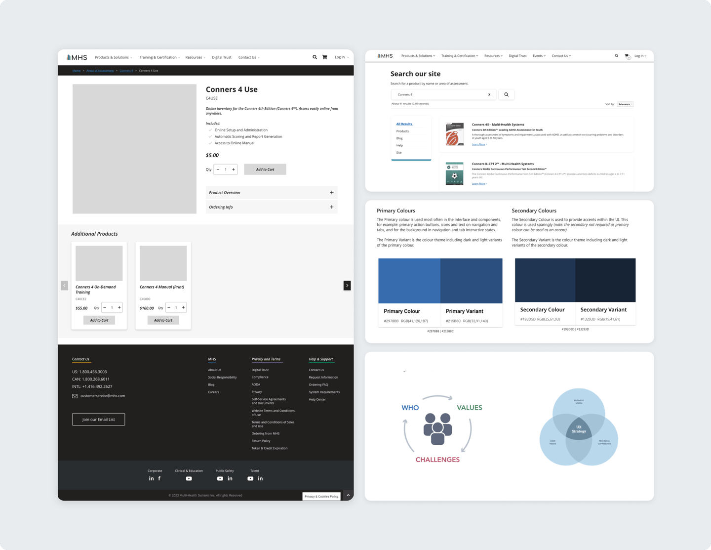
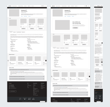
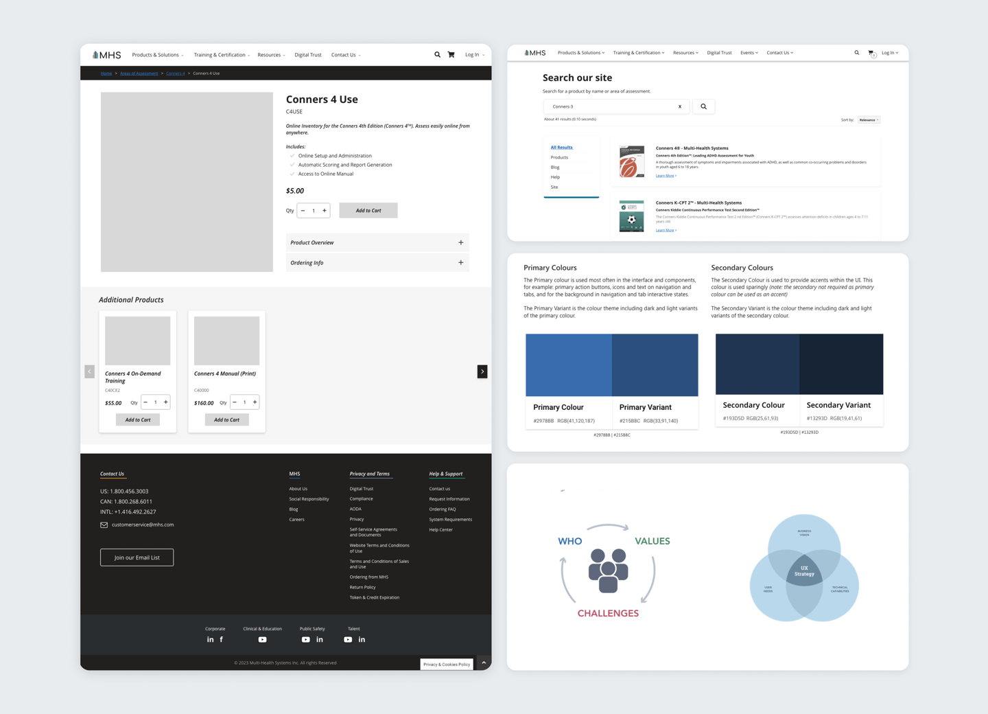
Page anchors and updated product cards make it easier for users to quickly jump to relevant sections, reduce unnecessary scrolling, and find products faster. The redesigned cards now display up to four times more products on screen, while new filters let users narrow options by category, or certification for a smoother shopping experience.
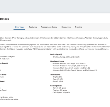
Product Discovery
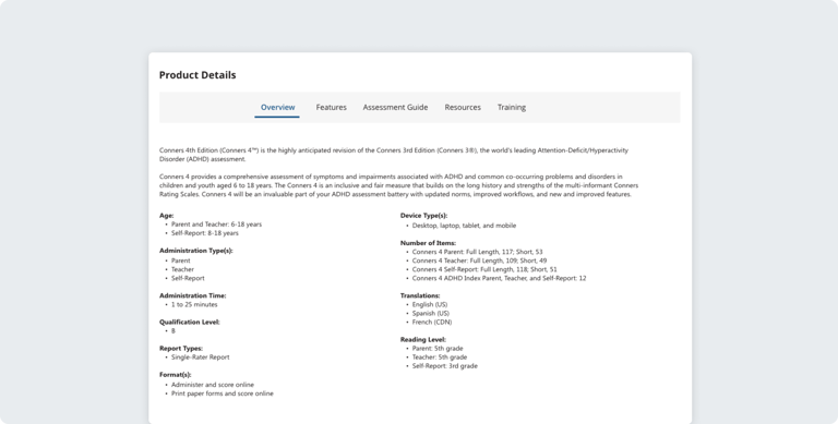
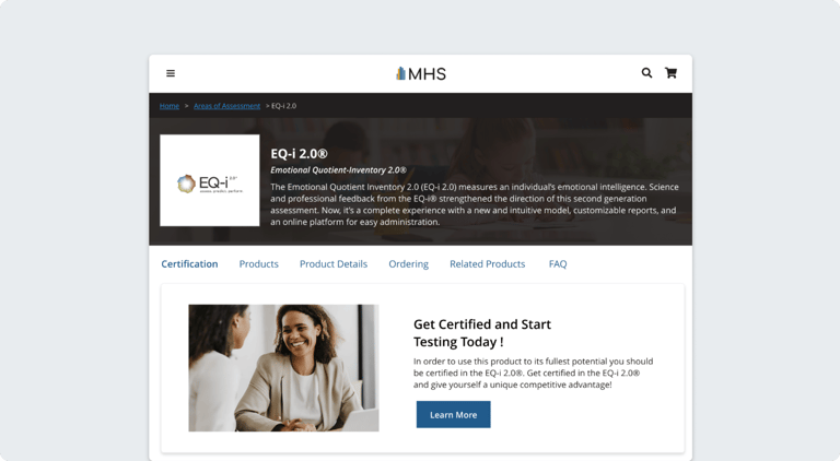
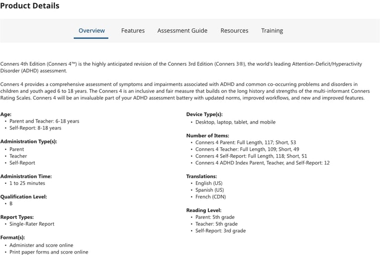
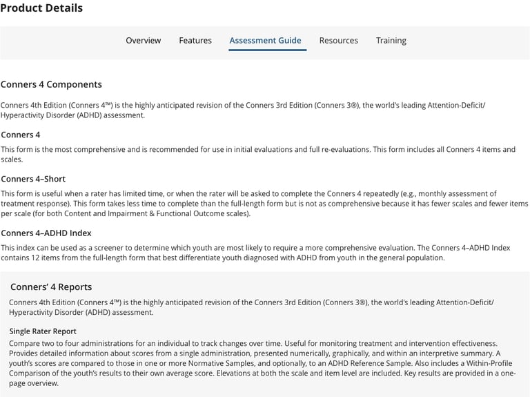
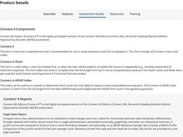
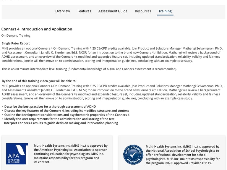
Product information that was previously spread across multiple sections was consolidated into a single, tabulation component named Product Details. Key features, resources, assessments, training, and certification details are now grouped logically (and show up contextually), making it easier for users to scan, compare, and understand each product without unnecessary friction.
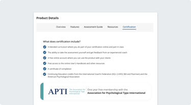
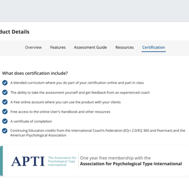
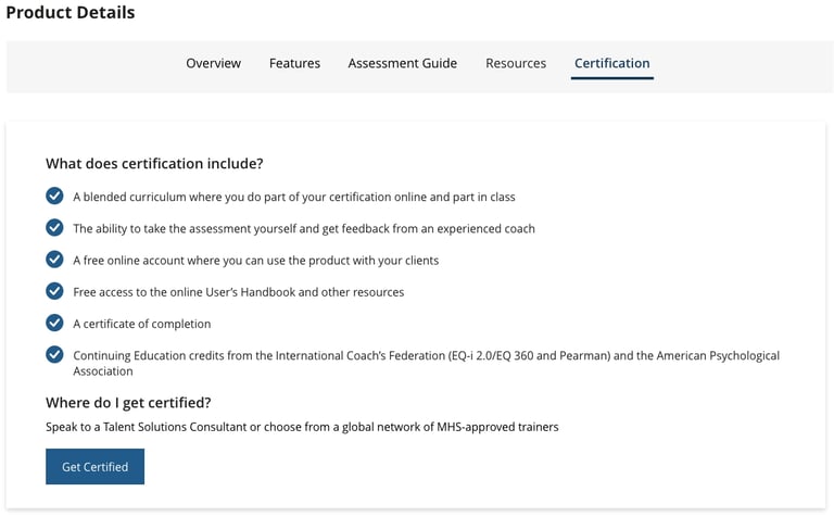
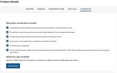
Product Certification
Based on SLT’s goal to reduce certification-related inquiries, I added a certification notice to the products required it, keeping the storefront clean for everything else. Certification products now include clear notice, and certification details and instructions can be found in the Product Details tabulation.

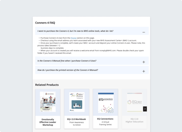
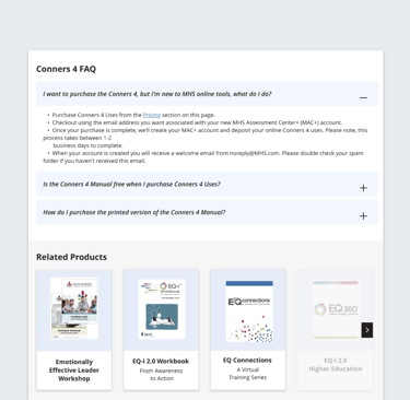
FAQ & Cross-Selling
To reduce friction, I added a contextual FAQ directly within the product page. This helps users quickly find answers to common questions about purchasing, access, and usage without leaving the storefront. We wanted related product recommendations to show relevant add-ons and complementary resources at the right moment in the journey.

Future Phase
In a future phase, the storefront will evolve beyond collection-based pages into dedicated product pages that allow each offering to stand on its own and improve SEO. We’re also planning to introduce federated search using Google’s API to make finding the right product faster and easier. Alongside this, the brand will be refreshed to feel more modern and consistent across the storefront. From there, we’ll continue iterating based on a growing understanding of our users, their needs, and the values we’re designing around.

MHS Storefront
A redesign of MHS’ digital storefront focused on improving product discoverability, clarity, and the overall purchasing experience.
Role
Role
Role
Quick Access

The goal of this project was to improve the overall storefront experience, in turn increasing product sales, and reducing certification inquiries sales. We wanted to make products easier to browse, understand, and purchase. To do this, we focused on:
Improving how product information is organized so key details are easier to find
Improve navigation to help users move through the storefront more quickly
Introducing new sections that surface important information without overwhelming users
Supporting cross-selling by helping users discover related products
Brief
MHS makes psychological assessments, training tools, and resources for professionals in mental health, education, public safety, and corporate fields. `
Users had a hard time navigating the site due to unclear product organization, poorly structured layouts, and accessibility issues, leading to confusion and
reduced confidence.
Problem
Project Goals
Timeline and Stakeholders
This project was delivered over a 25-week timeline and involved a lot of work with cross-functional stakeholders across design, development, marketing, and revenue departments. The roadmap below outlines each project phase, from early discovery and research to high-fidelity design, highlighting how decisions and priorities evolved over time.
Target Users
With a wide variety of products offered for a number of different verticals, MHS is an industry leader that uses research, science, and technology to deliver tools that help us better understand, develop, and support people and organizations. As Product Owner, I worked with marketing, UX, development, and research teams to address challenges, leading a redesign that improved navigation, accessibility, and created a more intuitive shopping experience.
Old Design

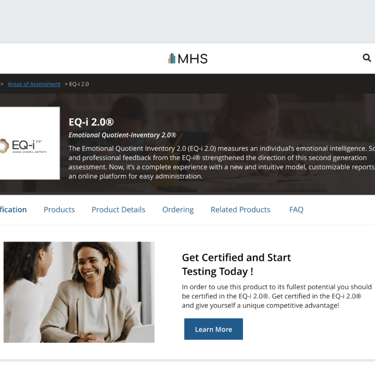
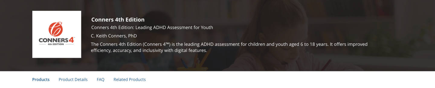
Product Discovery
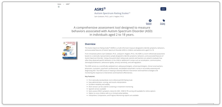
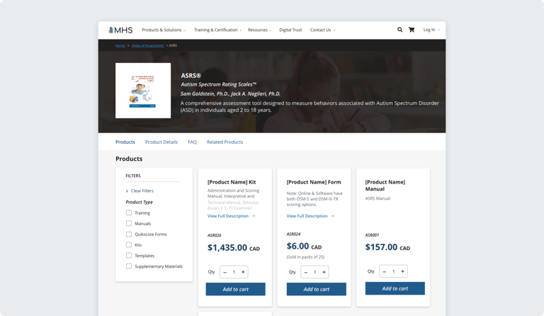
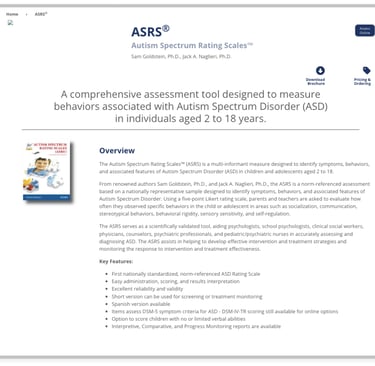
These sections of the storefront are the considered introductory and offer users a jump off point for understanding available products, certifications, and what they entail.
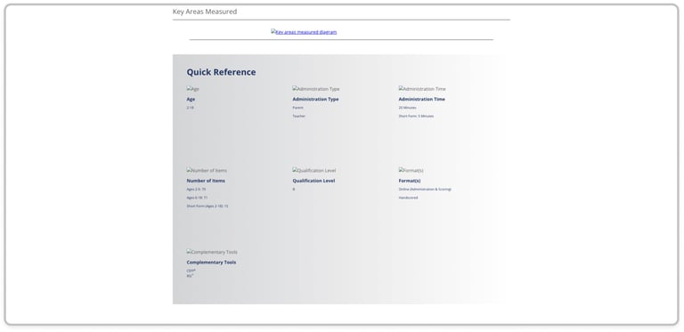
Product Discovery (Cont.)
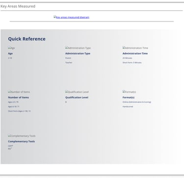
This quick reference area helps users quickly scan the key details of an assessment, including who it’s for, how it’s administered, and available formats.
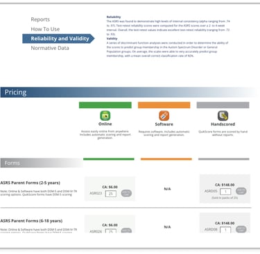
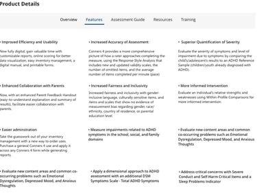
Product Browsing and Purchasing
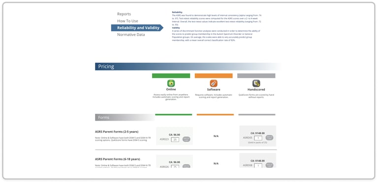
This section gives users a breakdown of pricing and use case information so users can compare online, software, and hand scored options and their pricing.
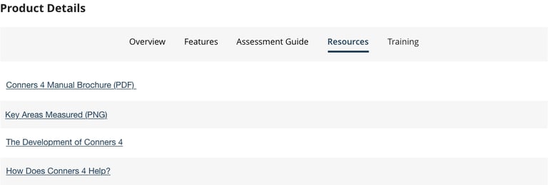
Product Resources
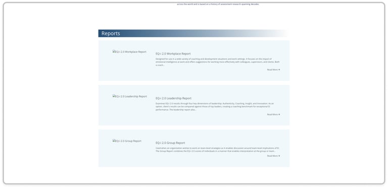
This section meant for product understanding shows which reports and supplementary resources are available and what each one is used for in a product's use context.
Research
Competitive Analysis
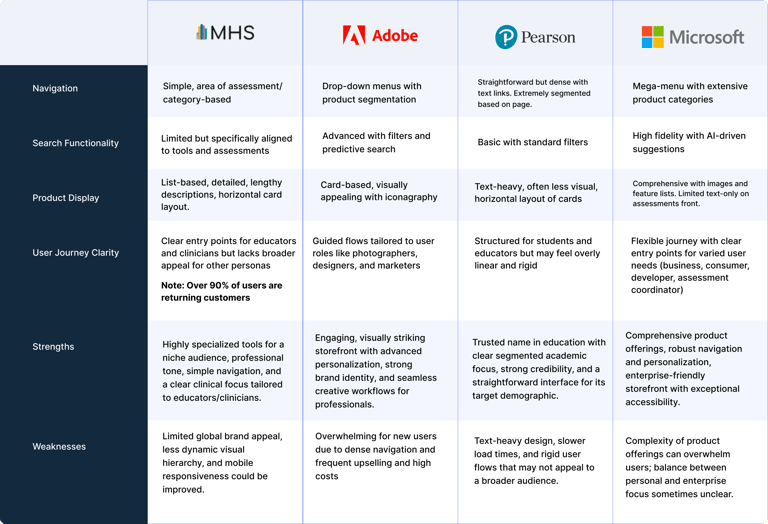
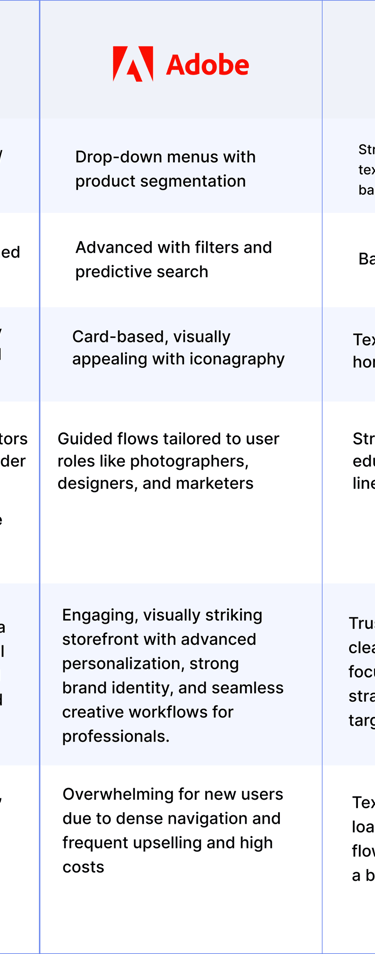
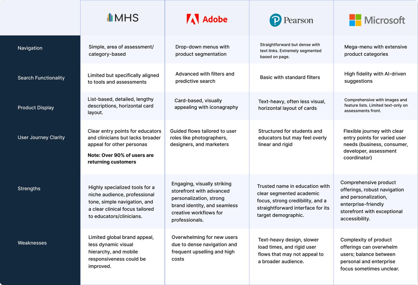
To understand how to improve the storefront, I had to understand the environment in which it lived. This meant analyzing competitors to find opportunities or gaps in their practices to inform design decisions, or rationale in my work on the MHS storefront. The following are 3 heavy hitters, or competitors who operate within the same digital space as MHS:
Adobe: Adobe was an easy choice as a reference because of how clearly its products are organized, paired with a clean interface and strong visual hierarchy that makes browsing feel simple and intuitive.
Pearson: Pearson was a key reference for how they organize large sets of educational content and tools into clear, intuitive collections, making it easier for users to discover what they need.
Microsoft: I referenced their clear navigation, and consistent design system to guide improvements in usability and inclusivity
Affinity Diagram/Mapping
Using affinity mapping, we grouped interview insights into themes that highlighted specific pain points. These ended up focusing on navigation, search and filtering, accessibility, visual hierarchy, and mobile usability, helping us quickly see where users struggled most when browsing, comparing, and finding products.
Product Framework
Building on the validated user flows and early sketches, we created wireframes to define layout, content hierarchy, and core interactions. This stage was somewhat of a "dynamic workshop" on clarity and usability, allowing us to refine structure, ordering and navigation before moving into higher fidelity designs.
Ideation Post Brainstorm
To explore potential solutions early on, we mapped out user flows and created preliminary sketches to test structure, navigation, and key interactions.
Final
Outputs
The final designs bring together research insights, validated flows, and refined layouts into a cohesive storefront experience. These outputs focus on improving discoverability, clarity, and usability while aligning with MHS’s brand, accessibility standards, and business goals.
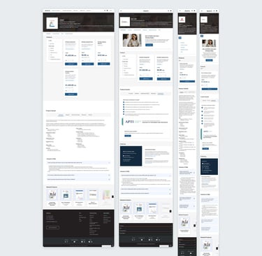
Designing the Product
FIRST ITERATION
Product Browsing and Purchasing
Page anchors and updated product cards make it easier for users to quickly jump to relevant sections, reduce unnecessary scrolling, and find products faster. The redesigned cards now display up to four times more products on screen, while new filters let users narrow options by category, or certification for a smoother shopping experience.
Product Discovery
Product information that was previously spread across multiple sections was consolidated into a single, tabulation component named Product Details. Key features, resources, assessments, training, and certification details are now grouped logically (and show up contextually), making it easier for users to scan, compare, and understand each product without unnecessary friction.
Product Certification
Based on SLT’s goal to reduce certification-related inquiries, I added a certification notice to the products required it, keeping the storefront clean for everything else. Certification products now include clear notice, and certification details and instructions can be found in the Product Details tabulation.
FAQ & Cross-Selling
To reduce friction, I added a contextual FAQ directly within the product page. This helps users quickly find answers to common questions about purchasing, access, and usage without leaving the storefront. We wanted related product recommendations to show relevant add-ons and complementary resources at the right moment in the journey.
Future Phase
In a future phase, the storefront will evolve beyond collection-based pages into dedicated product pages that allow each offering to stand on its own and improve SEO. We’re also planning to introduce federated search using Google’s API to make finding the right product faster and easier. Alongside this, the brand will be refreshed to feel more modern and consistent across the storefront. From there, we’ll continue iterating based on a growing understanding of our users, their needs, and the values we’re designing around.
Key Takeaways
I learned a lot through this project, especially since it was one of my first times leading both designers and developers on a product team. It pushed me to communicate more clearly, align people around decisions, and confidently move ideas forward. Working on the storefront also helped me grow my research skills, letting me directly apply user insights to the overall experience and interaction patterns. Collaborating closely with developers gave me a real understanding of technical constraints and taught me how to write clear acceptance criteria and hand off designs in a way that actually supports smooth implementation.


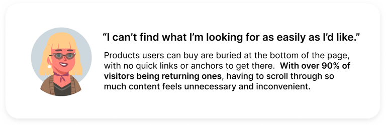
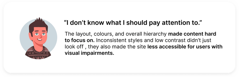
The Original Storefront: Not for Everyone
Confusing navigation: Users struggled to find what they needed due to a lack of clear structure and intuitive pathways.
Drop Off Rates: Analytics showed high drop-off rates before purchase, indicating friction. With 90% of paying users being return customers, the design prioritized them without accommodating new users.
Outdated design: The interface looked dated and didn’t inspire confidence or reflect a modern shopping experience.
Accessibility issues: Key features weren’t inclusive, creating barriers for users with diverse needs.
Problem
The Original Storefront - A Mobile Misstep
Poor breakpoint optimization: Caused sections to stack awkwardly, disrupting the flow and usability.
Small touch targets and inaccessible elements: Made navigation frustrating for mobile users.
Visual elements didn’t adapt well: This left content cramped or misaligned on smaller screens.
Accessibility shortcomings: Missing labels and poor contrast, created barriers for mobile users.
Problem
New Storefront Design
Modernized Layout: Clean, user-friendly design for easier navigation.
Improved Navigation: Streamlined menus and categories for quick access.
Enhanced Visuals: Updated imagery and design elements for a fresh look.
Optimized User Flow: Simplified shopping process for better usability.
Mobile-Friendly Design: Fully responsive for seamless use on all devices.
The solution
New Mobile Design
Mobile-Friendly Design: Fully responsive for seamless use on all devices.
No loss of functionality lets users access the same features and information from any screen, any time.
The solution

Here's what changed, and why.
Let's breakdown some of the key features implemented into this new storefront design, and talk about why they were added to ultimately contribute to the new incoming experience on MHS.com
Product Introduction and Page Anchors
Page anchors let users quickly jump to sections, reducing scrolling and improving navigation for a smoother shopping experience.


Updated Product Display and Filters
New card designs allow the storefront to display up to 4x more products on screen, maximizing visibility.
Brand-new filters enable users to quickly narrow down options by category, certifications, or price, streamlining the shopping experience.
This was achieved through close collaboration with our Shopify developer, leveraging existing product data to implement effective filtering.
Updated Details
Product details, previously scattered across pages, are now consolidated into a tabbed "Product Details" section, housing key features, resources, and training and certification info for quick access.


Product Ordering Details
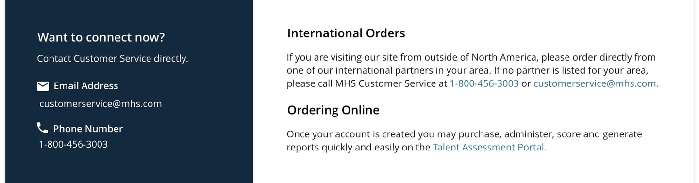
For products requiring specific training or certifications prior to purchase, a dedicated section provides clear instructions on who to contact and how to start the process, so users can easily meet these requirements.

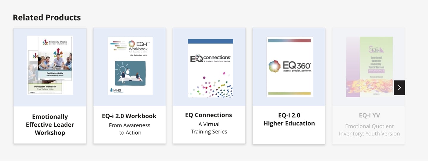
Related Products
I implemented a "Related Products" section that dynamically displays supplementary items to the user’s current selection.
Certification
I added a certification notice section at the top of the storefront for products requiring specific certifications.The notice only appears for products with this specific use case.


My main goal was to figure out what a better, high-fidelity storefront could look like for MHS’s large product catalogue. Through primary and secondary research, I worked to pinpoint what was working and what wasn’t, focusing on fixing user pain points and improving usability and accessibility. I intended on using previously gathered primary research findings regarding the storefront (from the research team) to inform any design decisions.
Research Goals
Research
To inform the redesign, I conducted a competitor analysis to identify industry standards and uncover opportunities to differentiate
the storefront.
Design Process
Weekly Manager Touchpoints
During the design process, I scheduled 30-60 minute weekly touchpoints with my manager to review the project's progress and ensure alignment with stakeholder expectations. Each week brought new design progression.
Stakeholder Presentation
I proposed the redesigned storefront to key stakeholders, including the VP of Revenue, Marketing Manager, UX Manager, and Chief Financial Officer. The presentation highlighted the identified issues, proposed solutions, and expected outcomes and was able to secure their feedback and approval.
Weekly Developer Touchpoints
Once the design was approved by management, I held 30-60 minute weekly touchpoints with developers to discuss technical feasibility, ensure project deadlines will be met, and address any challenges.
GitHub Reviews
In addition to regular touchpoints, we used GitHub to review development progress, track updates, and address issues collaboratively.