Project Midas
Project Midas is a conceptual tax monitoring experience focused on quick access, simplified understanding, and reducing friction during tax season.
Role
Role
Role

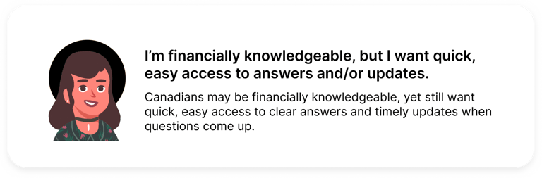
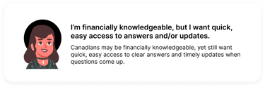
Quick Access

Project Midas
Project Midas is a conceptual tax monitoring experience focused on quick access, simplified understanding, and reducing friction during tax season.
Quick Access
Brief
As a young person in Canada, I approach taxes with caution rather than confidence. Not because the system is broken, but because it’s easy to lose track of what you need to know, what you need to submit, when you need to do it,
and why.
Canadians lack a centralized way to track their tax status, deadlines, and required documentation over time. As a result, tax education is lost, important dates are missed, and individuals are left reacting to issues only after they arise.
Problem
This is not a feeling or sentiment exclusive to me either. Over the course of my life, I've heard countless Canadians of all ages, backgrounds, and circumstances make their confusion or exhaustion with the Canadian tax system very clear. This goes deeper than the perception of "being taxed too much", it also pertains to being given tons of convoluted forms and websites, and being told to "figure it out". The unfortunate reality is that choosing not to, or failing to do so correctly, often results in a poorly timed, ominous email from the Canada Revenue Agency informing you of a “reassessment” of your return. This moment typically becomes one of anxiety, where you hope the outcome is positive, but more often than not, it leads to disappointment.
Research
User Interview
To understand the difference in lived experiences from different Canadians, I concluded that talking with them face-to-face in an interview format would make the most sense. Speaking to them in this way helped them naturally talk about their experiences with Canadian taxes, both positive and negative. Through these discussions, I was able to identify a few commonalities between each user's responses, ultimately allowing me to centralize the following pain points during this project:


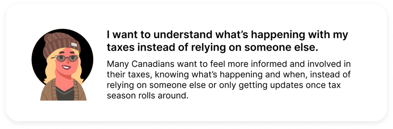
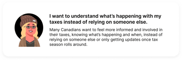
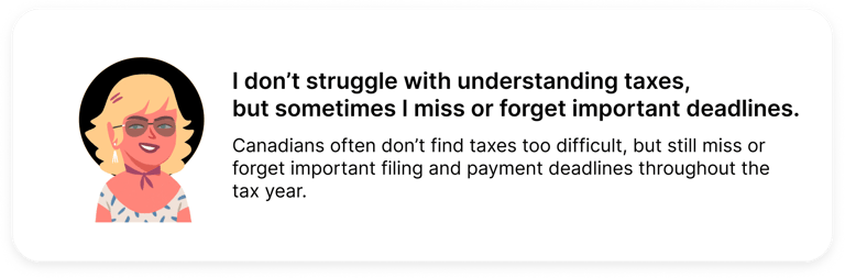
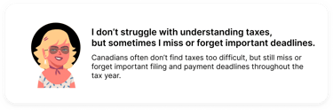
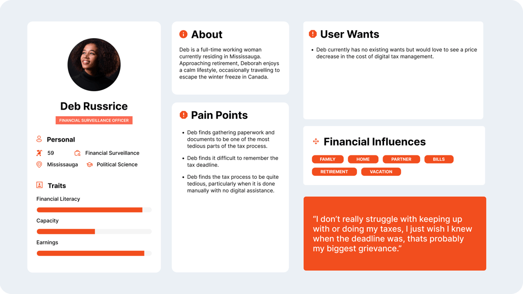
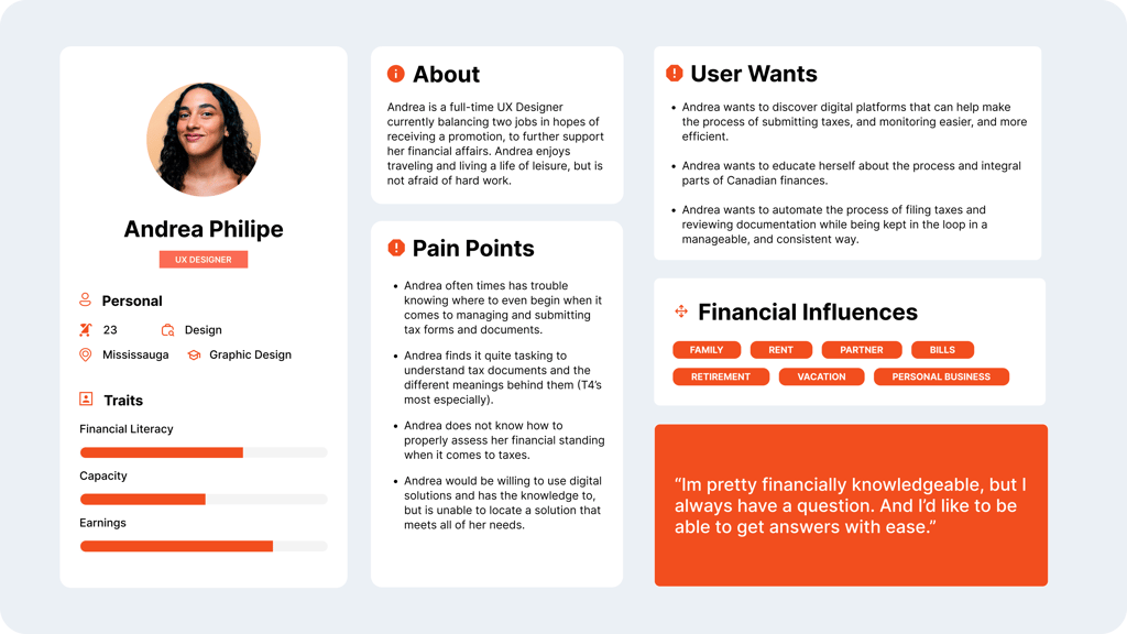
User Personas
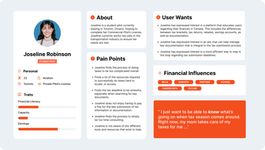
After reviewing and synthesizing my user interview notes, clear patterns began to emerge. These insights helped shape three personas, each representing different levels of experience with taxes and differing needs, goals, and priorities.

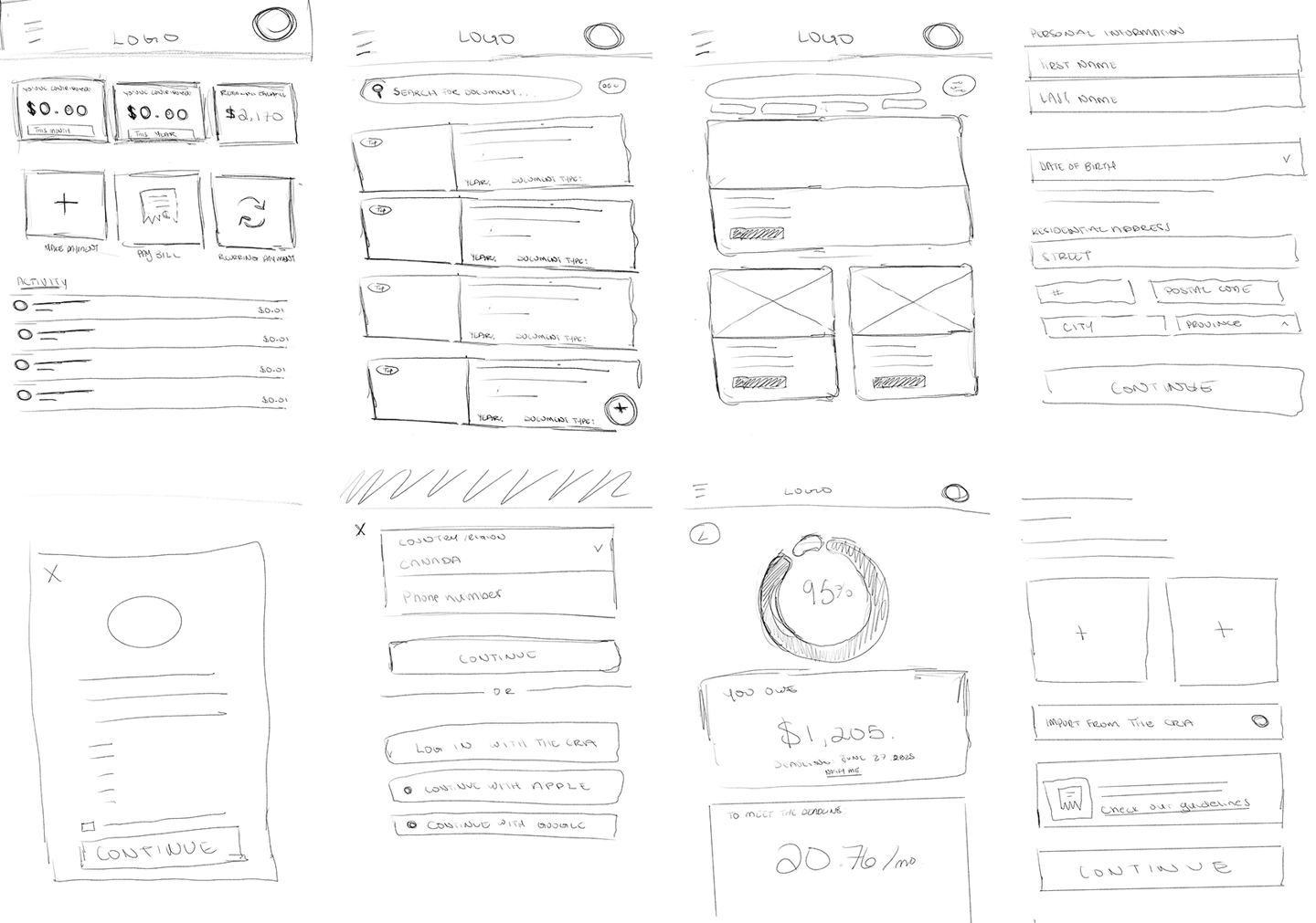
Once I had a clear picture of who I was designing for and the problems I wanted to address, I started putting together rough concept sketches to visualize layouts and think through how different elements would work.
Ideation Post Brainstorm
Design Reference
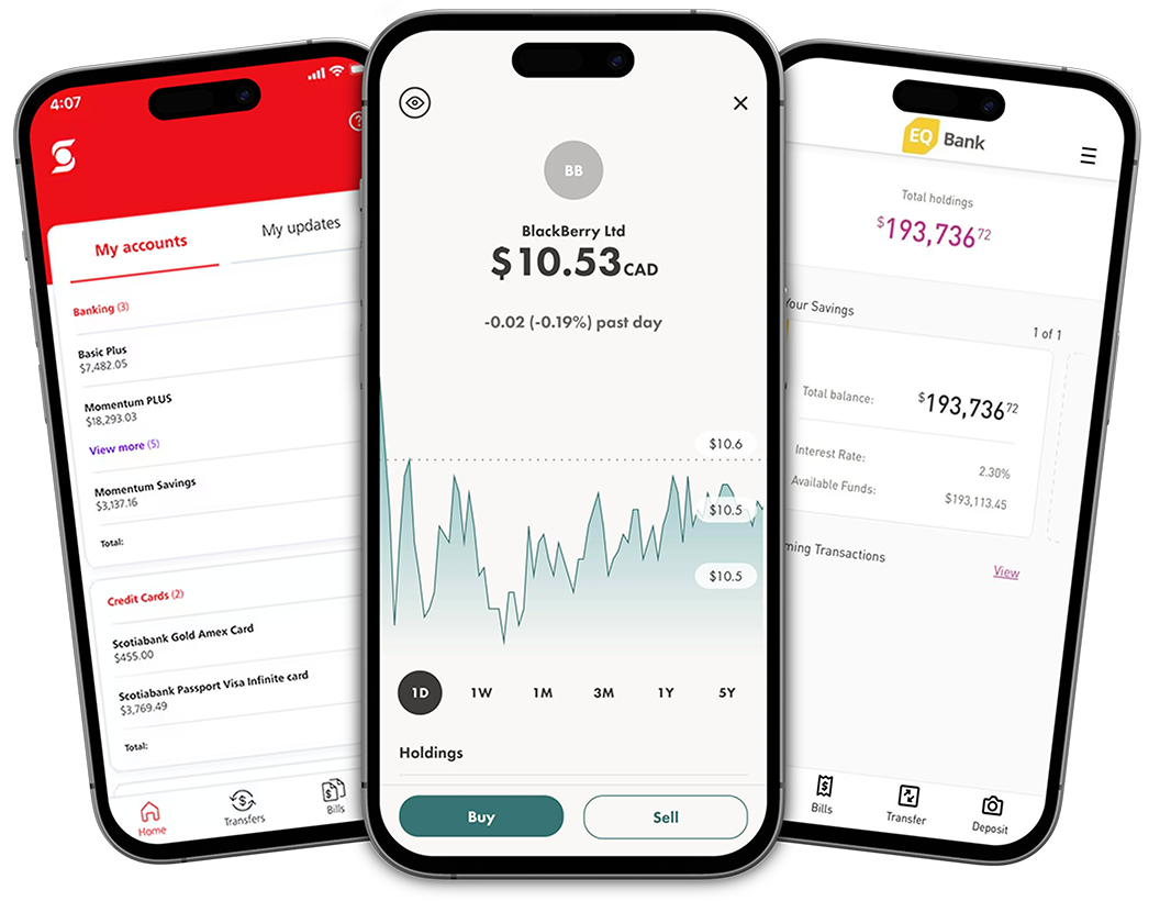
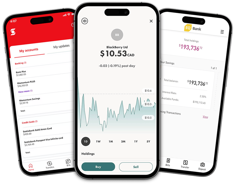
I referenced Scotiabank, Wealthsimple, and EQ Bank for their clean design, intuitive navigation, and simplicity, using them as inspiration to inform my design decisions as they are similar in nature/industry.
Wireframing The Solution
Wireframing gave me the space to think through how users would actually move through the experience. At this stage, I focused on layout, information prioritization, and how key features like progress tracking, documents, and learning resources could work together in a way that felt simple and reassuring rather than overwhelming.
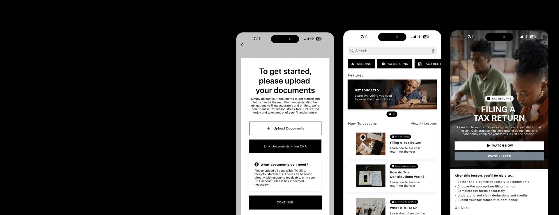
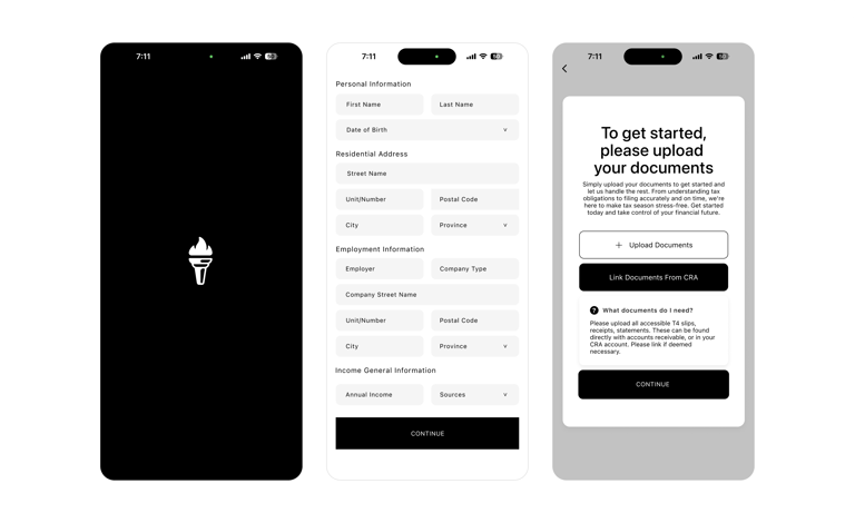
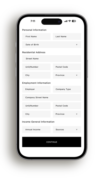
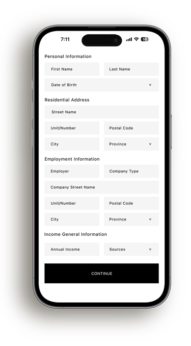
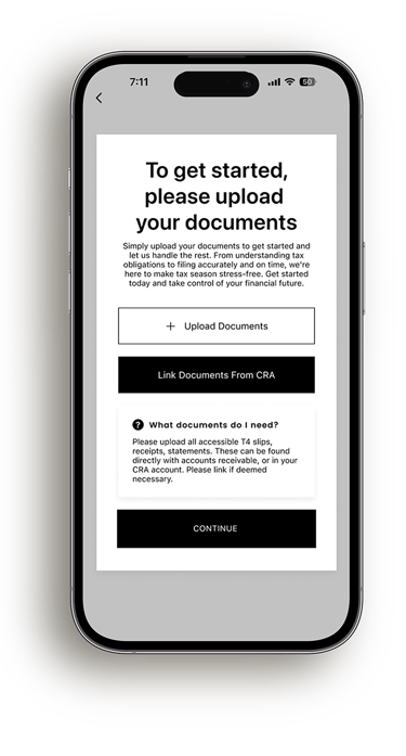
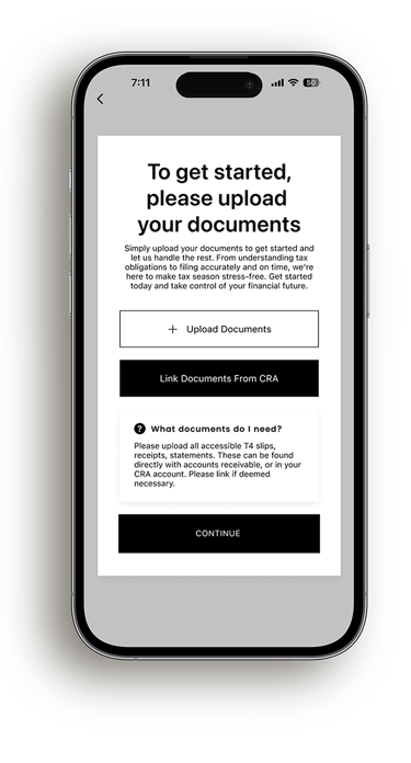
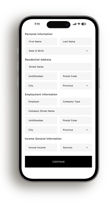
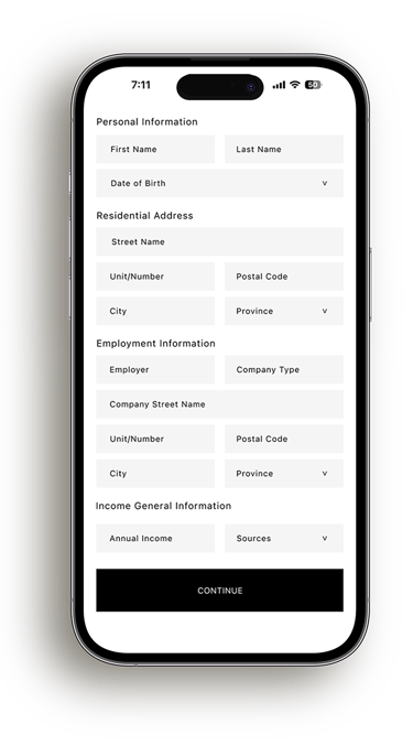
Onboarding was intentionally designed to feel supportive rather than intimidating. Instead of asking users for everything at once, information is collected gradually and paired with clear explanations around why each step is needed. Giving users the option to upload documents early or link directly with the CRA helps reduce uncertainty and builds confidence right from the beginning.
Design:
Onboarding
Design:
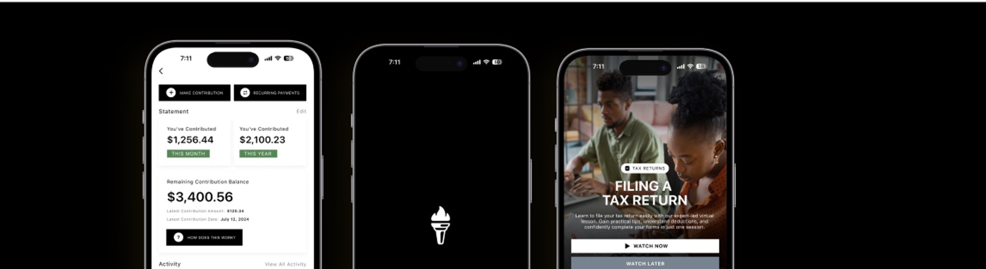
Home Hub
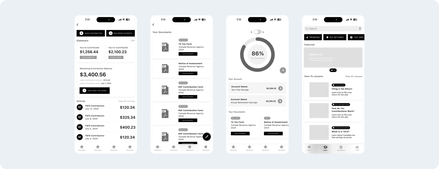
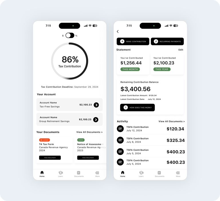
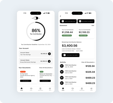
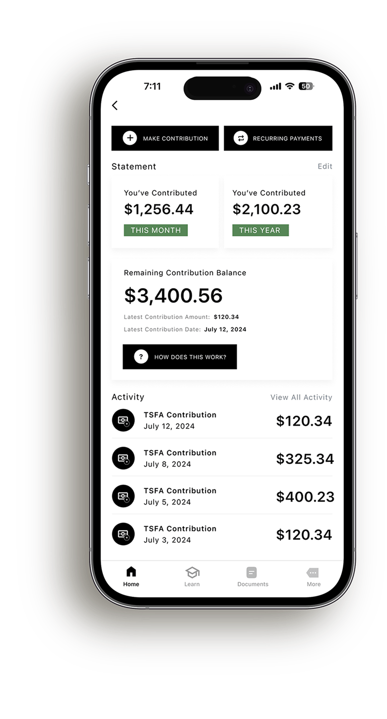
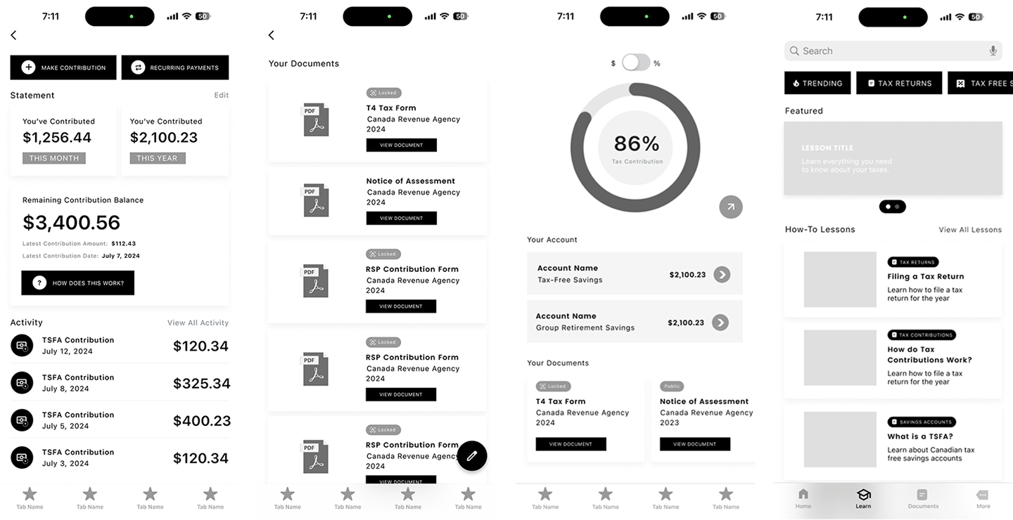
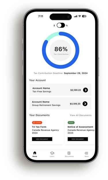
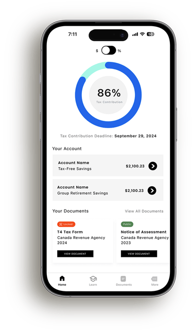
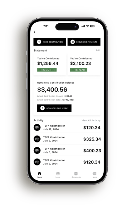
The Home Hub acts as a central spot where users can get a quick at a glance understanding of their tax situation. Instead of digging through documents or trudging through calculations, users are shown progress, balances, and recent activity in a way that feels straightforward and approachable. The goal was to replace uncertainty with clarity the moment the app is opened.
The progress wheel gives a clear view of contribution status, allowing users to toggle between percentage and dollar based progress, and helps users stay on track to avoid owing taxes at year end.
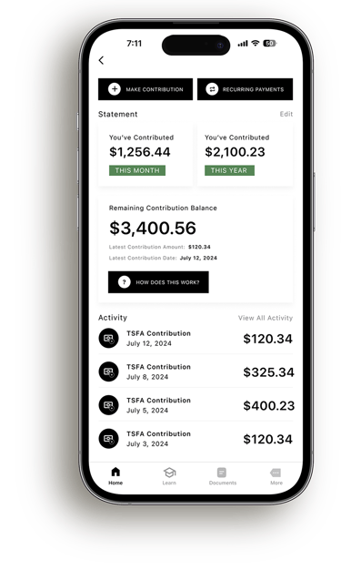
Account breakdowns let users get a live look at their account balances/contribution amounts.
Account details let users view their remaining contribution balance, make contributions, view activity, and more.
Design:
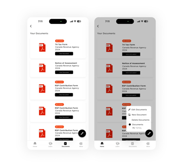
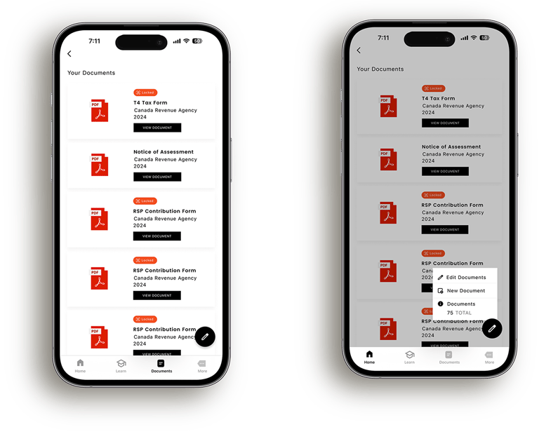
Document Manager
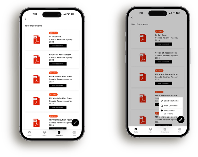
The Document Manager gives users a single space to store, view, and manage all tax-related documents in one place. Important forms such as T4s, Notices of Assessment, and contribution records are clearly labeled and organized, allowing users to quickly understand what documents they have on file and access them when needed.

Design:
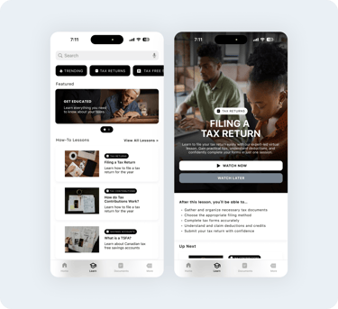
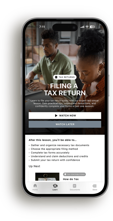
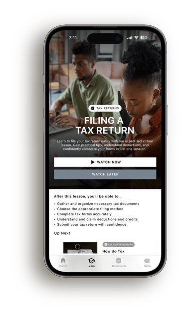
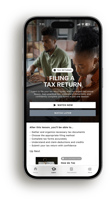
Education Hub
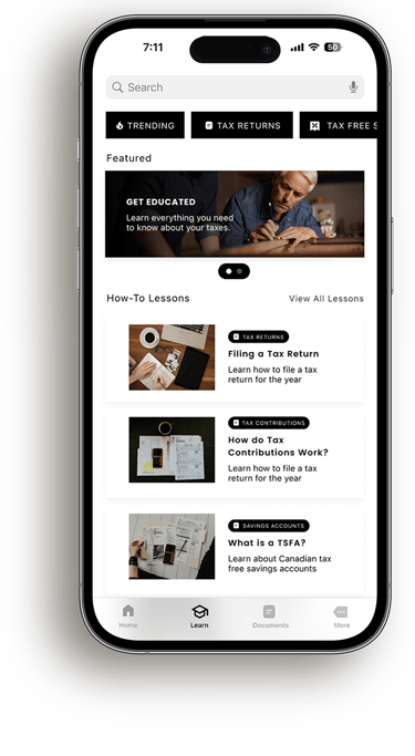
The Education Hub gives users a simple place to learn about taxes without feeling overwhelmed. Lessons are grouped by topic and presented in an easy to browse format, making it simple to explore specific questions or follow along step by step. By breaking down complex concepts into clear, approachable content, the hub helps users build confidence over time and feel more prepared when managing their taxes.

What Comes Next?


Future Phase
Taking things beyond mobile
I want to ultimately expand this project's scope and have it accessible across all types of devices. This includes desktops, tablets and more. Given the shorter duration of the project, it was important that I kept my focus on the mobile space, as this app would generate the most initial users on this platform.
Bringing a brand to life
Because I was focused a little bit more on form and function, I'd like to expand the application's design language from a visual perspective. To do this, I'd have to curate a design system with colours, icons and components that all contribute to the design's overall visual fidelity.
Connecting more than just your taxes
Ideally, direct banking integrations would allow the application to reflect users’ finances more accurately in real time, streamlining preparation and decision making throughout tax return season.
Onboarding
The onboarding process makes it easy to get started by asking for key details like your industry, tax bracket, earnings, and experience with taxes.
I wanted to accommodate Canada Revenue Agency integration so you can upload documents directly, cutting down on manual work and reducing mistakes. This keeps things quick and compliant.
The Solution
Central Hub
Tax Contribution Meter: The tax contribution meter provides a visual representation of progress toward annual tax contributions.
Tax Deadline: The tax deadline feature highlights upcoming filing dates, keeping users informed to avoid late submissions and penalties.
Account Listings: The account listings provide a quick summary of users' financial accounts, taking them to detailed breakdowns with one click.
Documents: The documents section offers quick access to essential tax forms and records, streamlining the process of managing and submitting required paperwork.


The Solution
Account Breakdown
Make a Contribution/Recurring Payments: The Make a Contribution/Recurring Payments feature enables users to add funds or set automatic contributions.
Contribution Status: Provides a clear snapshot of the user's financial contributions, displaying totals for the current month and year helping them track their progress.
Remaining Balance/Learn Along: The Remaining Contribution Balance tracks how much users can still contribute toward
their limit.Account Activity: Provides a detailed view of past and upcoming transactions, including contributions, helping users stay informed about their financial movements and maintain control over their accounts.
The Solution
Document Manager
Document List: Displays all tax-related documents, such as T4s, Notices of Assessment, and Contribution Forms, for easy access.
Locked Documents: Shows documents that are secured or restricted, showing their locked status for privacy.
Edit Options: Includes a floating button for quick actions like editing, adding or removing documents.
The Solution
Education Hub
The Solution


The Education Hub gives users practical lessons, tutorials, and resources on things like filing taxes, making contributions, and saving money. It’s designed for self-paced learning, making it easy to boost financial knowledge and take control of your finances.
Research Methods
User Interviews
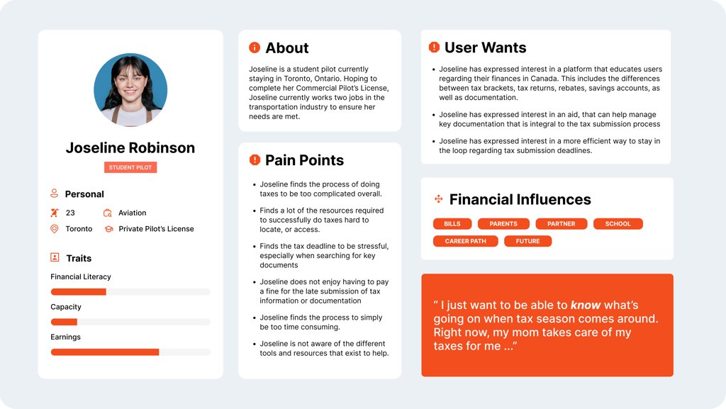
I spoke to 6 participants all with varying financial backgrounds to understand their different experiences and needs.
I spoke with two students, two recent graduates working full-time, and two adults nearing retirement. Here are my key findings:
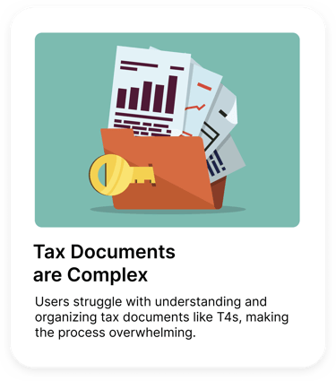
Tax Documents Are Complex: Users struggle with understanding and organizing tax documents like T4s, making the process overwhelming.
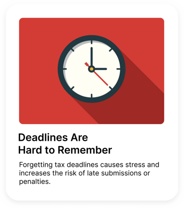
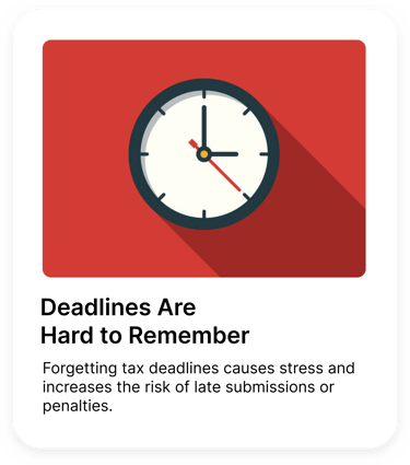
Difficulty Remembering Deadlines: Forgetting tax deadlines causes stress and increases the risk of late submissions or penalties.
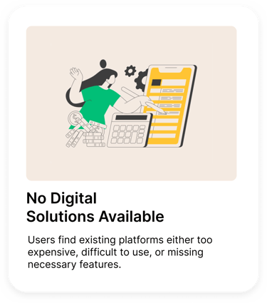
Lack of Accessible Digital Solutions: Users find existing platforms either too expensive, difficult to use, or missing necessary features.
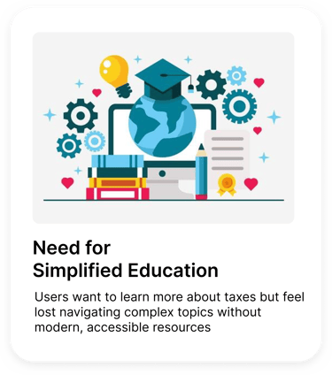
Need for Simplified Education: Users want to learn more about taxes but feel lost navigating complex topics without modern, accessible resources


So, how might we...


Design a platform that simplifies tax management, enhances financial literacy, and empowers users to manage documents, accounts, and deadlines effortlessly?
Design Process
Design Process
After conducting user testing with sketches, I learned that users appreciate the overall design but emphasized the importance of it resembling apps they were already familiar with. I kept this in mind when refining the sketches to wireframes.
Wireframes
Design Process


Taking a closer look after the project closed, I wanted to add more contemporary and familiar design components to improve the overall look of the digital output, without sacrificing its original scaffolding.
What would I implement in future phases?
Platform Expansion
Future phases include a desktop version of the platform, offering enhanced accessibility and features, ensuring seamless financial management across devices for our users.
Refine Brand Identity
I would refine the brand identity by evolving the current simple color palette and design system. The goal would be to maintain the platform's efficiency while enhancing its visual appeal and creating a more recognizable and memorable brand.
Bank Account Linking
I’d like to include linking accounts to online banking platforms, enabling seamless integration of banking and tax contribution information. This will streamline the user experience and make managing finances even more efficient.
If you made it this far,
Thank you for viewing this case study, please feel free to view some of my other projects!